深圳招商海运中心
-
项目名称:
-
项目地点:广东 深圳
-
项目规模:56500平方米
-
设计公司:
-
施工单位:毕路德国际
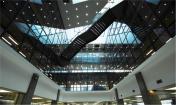
口岸楼大堂设计中,设计师利用层高的优势,在吊顶做了很多盒体,平面呈矩阵的布置方式,但在高低,色彩上富于变化,形成一个丰富的表皮肌理,两侧的高耸的墙面,我们把它想像成巨大的集装箱,利用错位的条纹,组织成一个丰富的集装箱表皮。
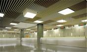
报关大厅的顶部,利用了条状彩色铝板的特点,形成了平面化的pattern。在组织色彩的时候,米色、白色、棕色为办公室空间注入了温暖的情绪。
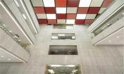
主塔楼的大堂为双层高空间中,设计师把中间的核心筒部分利用表皮化的方块语言雕塑出形体,顶部采用了“黄金分割”,做了一个大小白色方块的构成变化。
In Port lobby, designers use the advantage of floor height and make a lot of box shapes in the ceiling. The plane then is presented as matrix layout, but varied in height, and color, forming a rich texture of the ceiling skin. The towering walls at both side, we imagine them as huge containers, by using misplaced stripes, to create a rich container skin.
The top of the customs hall, adopts the characteristics of colored aluminum strips, and form plane patterns. On color side, beige, white and brown color fills the office space with warm mood.
The lobby of the main tower is of double height. The designer sculpted the core in skin language. The "golden section" was applied to the core top to realize the changes in the composition of the white box.


