重庆中瑞产业园景观设计 | 纬图景观
-
项目名称:重庆中瑞产业园
-
项目地点:重庆市北部新区金州大道中段
-
项目规模:56000㎡
-
设计公司:
-
委托方:重庆至上机械制造有限公司
-
建成时间:2019
-
图片来源:纬图设计机构
项目背景
Project Background
项目位于重庆市北部新区格力智能产业园内,紧邻兰海高速和金州大道。紧邻照母山公园,九曲河湿地公园,重庆园博园三大公园,生态自然资源丰富。周边有四通八达的城市交通立体网络,交通物流便利。
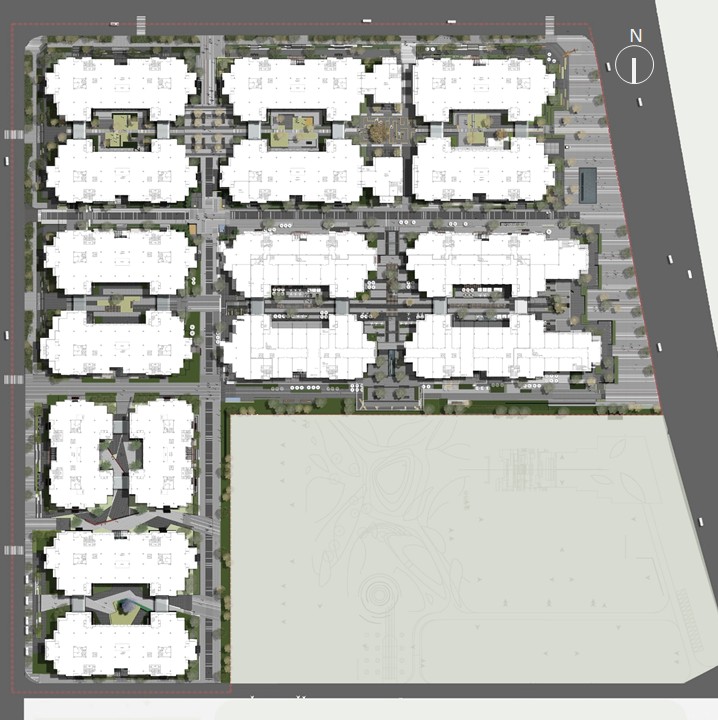
项目分为三期开发,一期建设范围96997㎡,建筑占地面积40955㎡,主要为企业办公楼,建筑规划布局通过一纵两横,三条街道将办公区域划分为了6个建筑庭院,其中5个地面庭院与建筑一层相连,另一个是在建筑2层以及三层的屋顶上。整个项目的消防车道允许做隐形车道处理,也给地面铺装的连续性和整体性提供了机会。
The project is located in the Gree Intelligent Industrial Park in the northern new district of Chongqing, close to the Lanhai Expressway and Jinzhou Avenue. It is close to Zhaomushan Park, Jiuqu River Wetland Park, and Chongqing Garden Expo Park, which are rich in ecological and natural resources. Surrounded by a three-dimensional city transportation network, the transportation and logistics are convenient.
The project is divided into three phases of development. The first phase has a construction area of 96,997 square meters and a building area of 40,955 square meters. It is mainly an enterprise office building. The architectural planning layout is one vertical and two horizontal. The three streets divide the office area into six building courtyards, of which 5 A ground courtyard is connected to the first floor of the building, and the other is on the roof of the second and third floors of the building. The fire lanes of the entire project are allowed to be treated as invisible lanes, which also provides opportunities for the continuity and integrity of the ground pavement.

设计策略
Design Strategy
作为重庆市国别级产业园,中瑞产业园立足两江新区发展战略,打造集国际化总部办公、创新型企业孵化、精致商务休闲于一体的综合性开放园区。目前已与瑞士及欧洲200余家具有核心领先技术的中小科技企业建立了互动。
纬图参与设计的一期用地,建筑由6栋美式学院派商务独栋围合而成。作为中西方文化与产业的集中交流地,景观设计以“融”为主题进行延展。首先,在分析受众群体的行为习惯与性格特征基础上,赋予丰富的文化内涵,满足不同文化背景的办公人群。其次,结合人流及行为的规律,最大限度打通场地脉络,将内外庭院、内外建筑、内外空间充分融合。最终,设计为使用者提供了多元的人性化场所及丰富的景观层次,满足企业在办公之外的户外交流所需,酝酿出独特的企业文化,形成生活化办公场景加国际化未来办公体系,营造一个自由、国际、艺术、开放、多元化的办公环境,一个开放的交流平台,创意的展示基地,个性化的商业中心,以及一个充满艺术的空间。
As a country-level industrial park in Chongqing, Sino-Swiss Industrial Park is based on the development strategy of Liangjiang New District, creating a comprehensive open park integrating international headquarters office, innovative business incubation and exquisite business leisure. At present, it has established interaction with more than 200 small and medium-sized technology companies with core leading technologies in Switzerland and Europe.
Weitu participated in the design of the first phase of the site, the building is formed by 6 American academic business buildings. As a centralized exchange place between Chinese and Western culture and industry, the landscape design is extended with the theme of "melting". First of all, based on the analysis of the behavior habits and personality characteristics of the audience, it is endowed with rich cultural connotations to meet the office population of different cultural backgrounds. Secondly, combining the flow of people and the laws of behavior to maximize the context of the site and fully integrate the inner and outer courtyards, inner and outer buildings, and inner and outer spaces. In the end, the design provides users with a variety of humanized places and rich landscape levels to meet the outdoor communication needs of enterprises outside the office, brewing a unique corporate culture, forming a living office scene plus an international future office system, Create a free, international, artistic, open, and diverse office environment, an open communication platform, a creative display base, a personalized business center, and a space full of art.
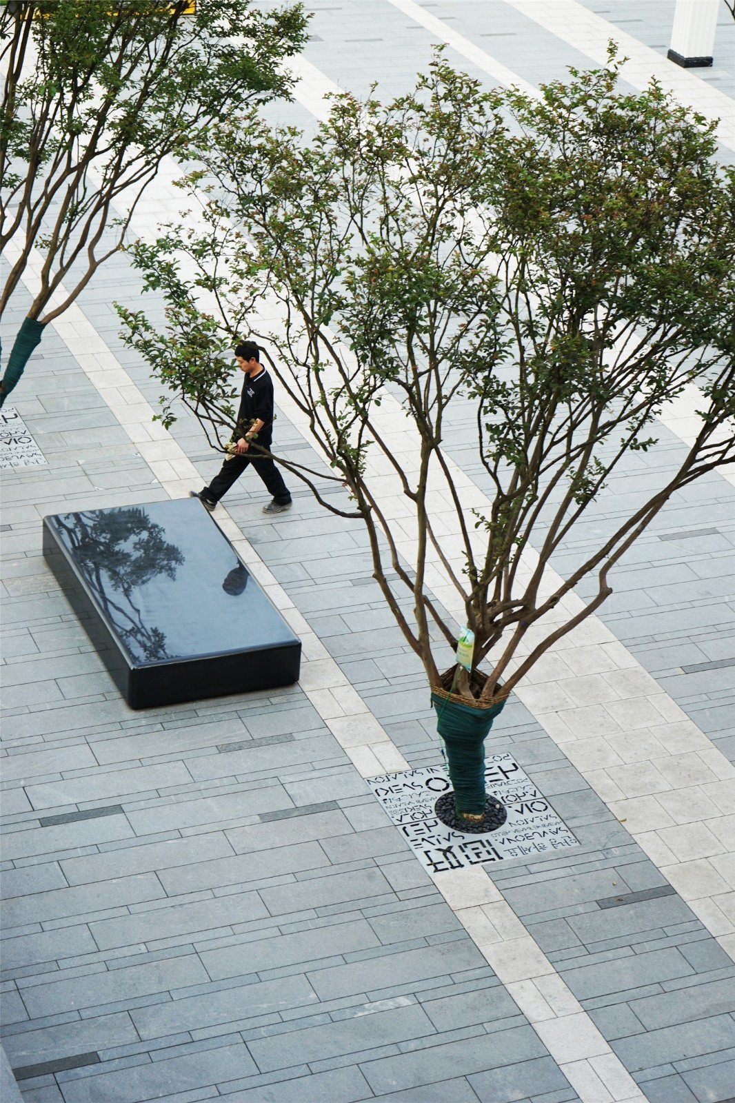
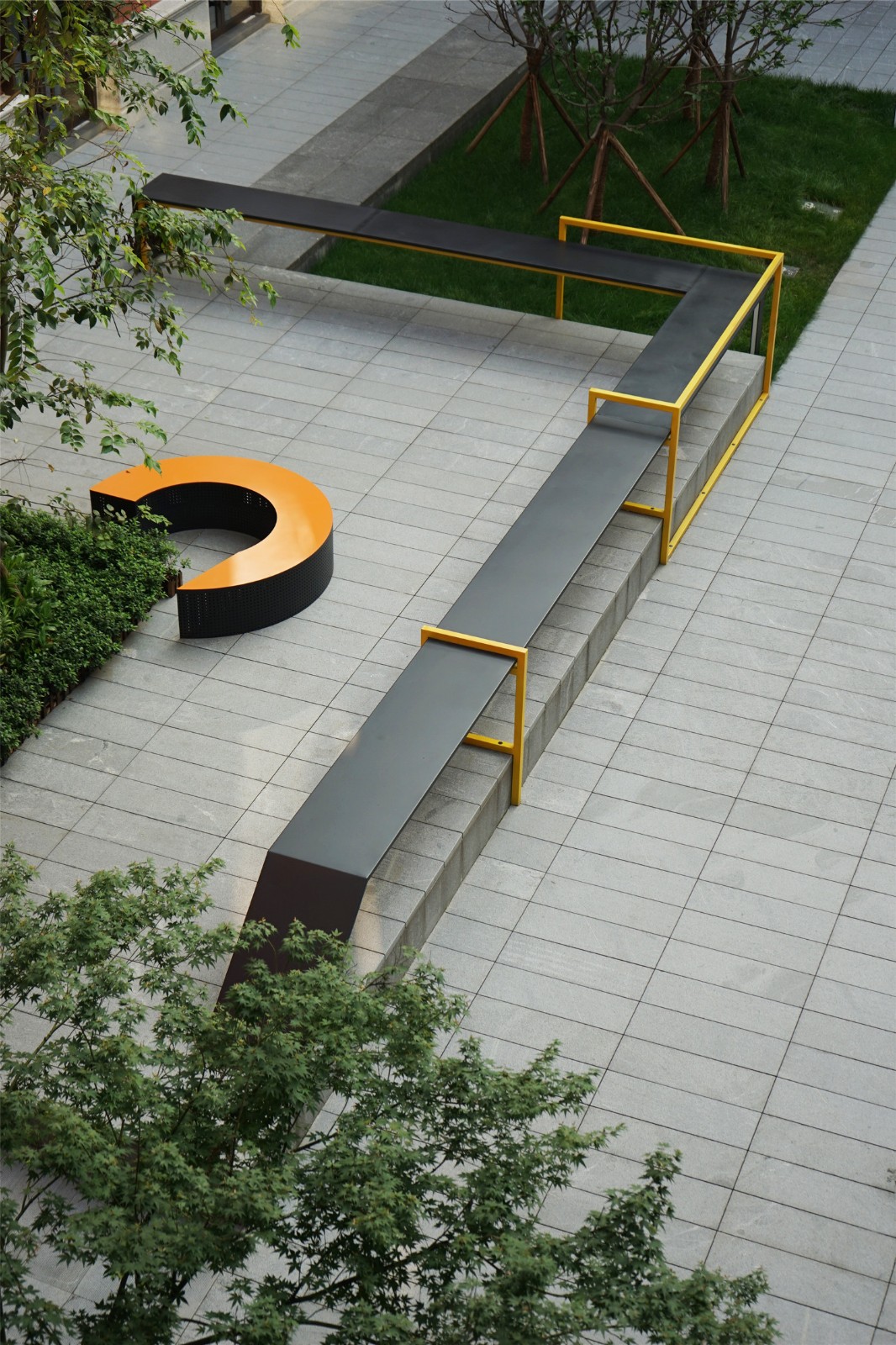
设计首先对于竖向关系和交通流线进行了梳理和完善。一期所有建筑都落在车库顶板上,建筑正负零标高基本与周边的道路标高差从1米到2米不等,让每一个建筑庭院园都成为一个孤立的小岛。
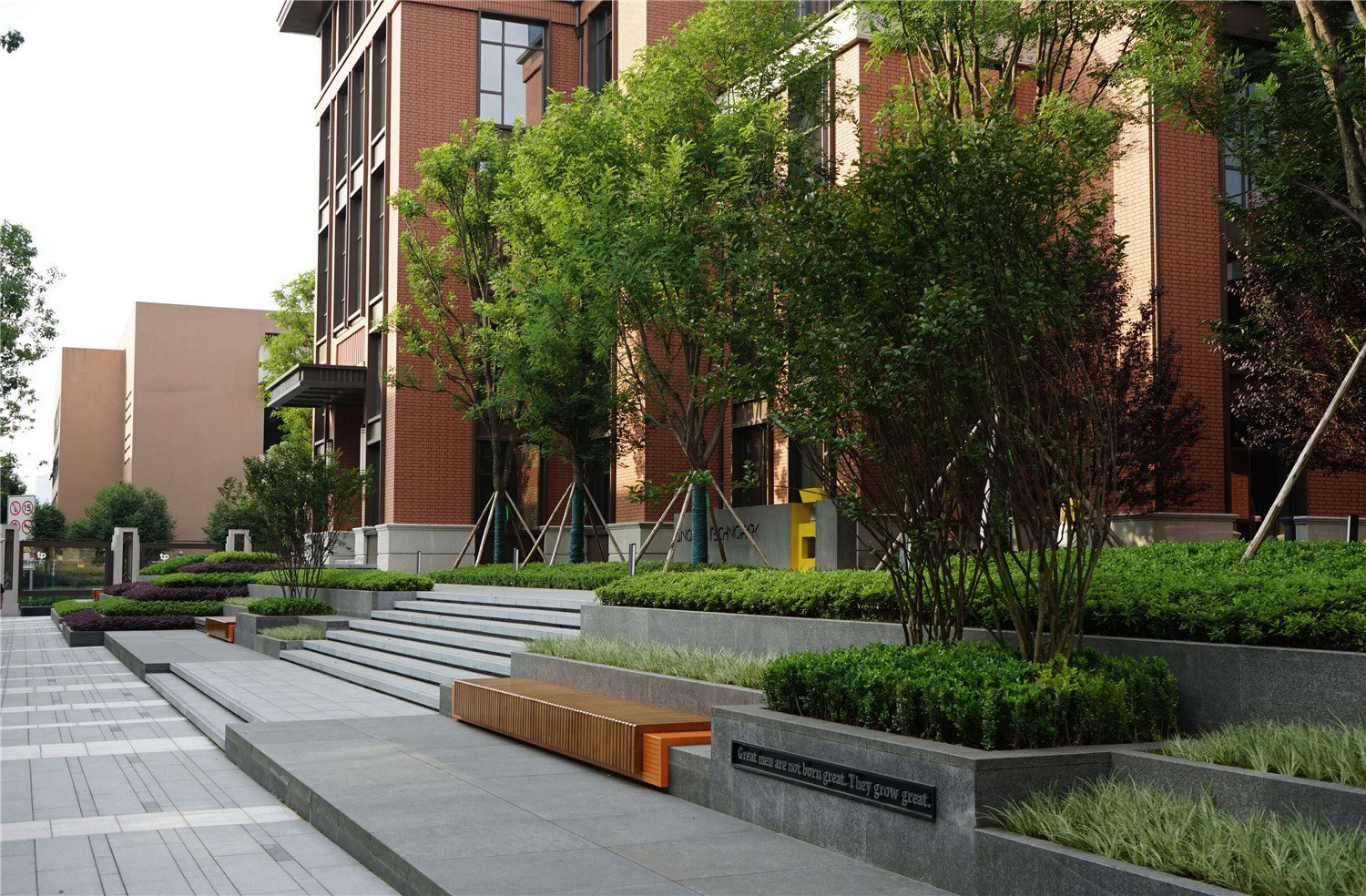
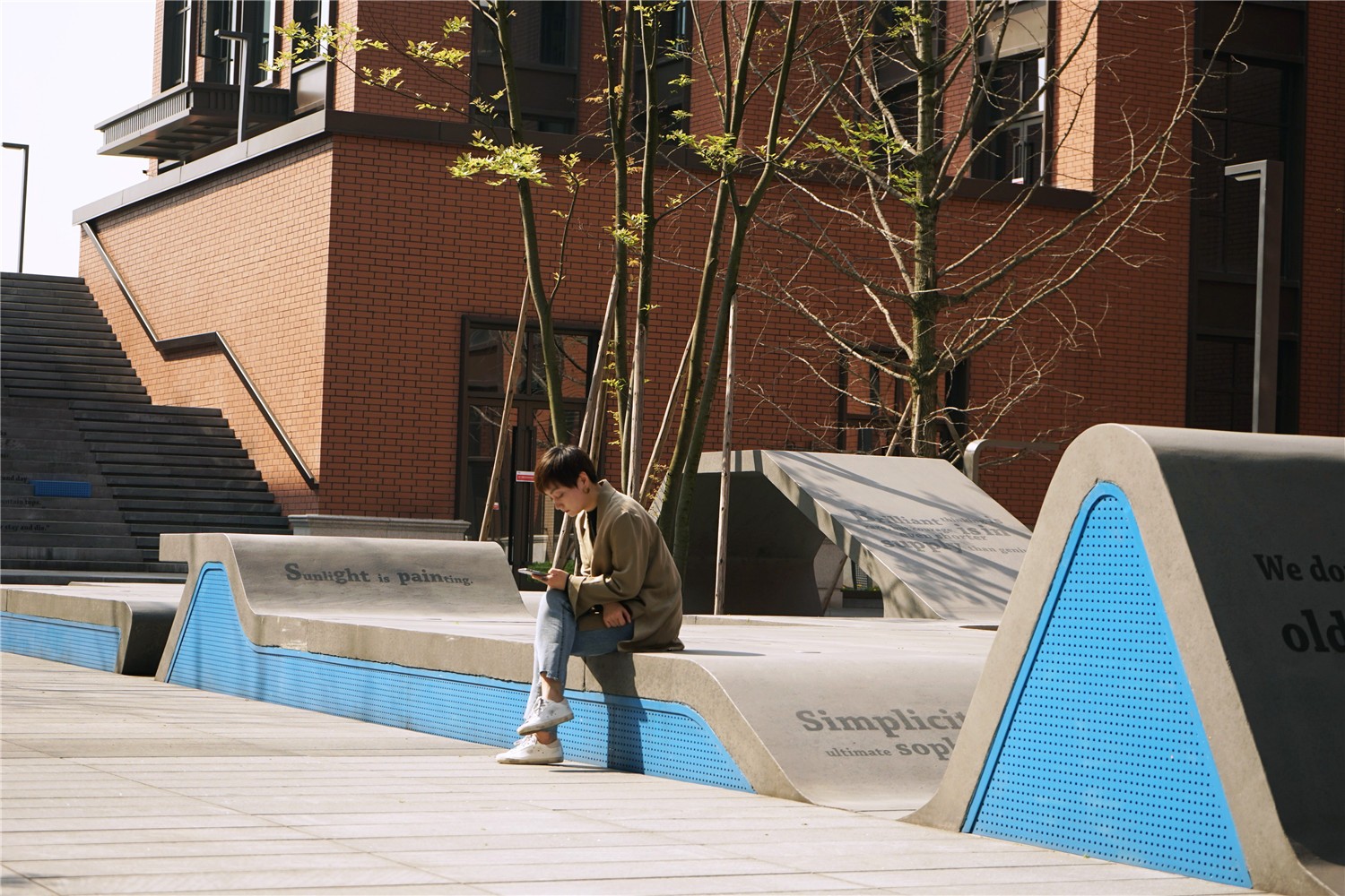
为了让整体的交通更连贯舒适,设计用台地将建筑的外围边界环绕起来,将上下交通的台阶,户外休息坐凳,种植池甚至场所文化的表达,庭院的色彩性格都融入其中,形成了一个形式统一,功能多元,内蕴丰富的场地边界形象,并将几个孤立的岛屿连成了一片完整的大陆。不仅园区外场从任何一个接口都可以轻松愉悦的进入内部,各个建筑庭院之间的交通联结也更为流畅和紧密。
The design firstly sorted out and perfected the vertical relationship and traffic flow lines. All buildings in the first phase fall on the roof of the garage. The difference between the positive and negative zero elevation of the building and the surrounding road elevations range from 1 meter to 2 meters, making each building courtyard garden an isolated island.
In order to make the overall traffic more coherent and comfortable, the design uses a platform to surround the outer boundary of the building, and the upper and lower traffic steps, outdoor rest benches, planting ponds and even the expression of the site culture, the color and character of the courtyard are integrated into it, forming a The form is unified, the functions are diverse, the image of the site boundary is rich, and several isolated islands are connected into a complete continent. Not only can the outside of the park enter the interior from any interface easily, but the traffic connection between the various building courtyards is also smoother and tighter.
为了提升流线的使用密度和强度,设计对所有原始交通比较局促的空间,都做了细心的处理,让交通更舒适。如西侧两个车库出入口上方,正好是在两个建筑庭院的边界处,出入口的开口与两侧建筑墙面的距离都已经很窄,但为了让庭院的此端不变成死胡同,设计将这个狭窄的通道打开与园区外界联通,通过对车库出入口屋盖的艺术化设计以及软景的精心处理,让这个狭窄的空间也充满了行走的乐趣。
In order to improve the use density and strength of the streamline, the design has carefully treated all the relatively cramped spaces of the original traffic to make the traffic more comfortable. For example, above the two garage entrances on the west side, just at the boundary of the two building courtyards, the distance between the openings of the entrances and the building walls on both sides is already very narrow, but in order to prevent this end of the courtyard from becoming a dead end, the design will This narrow passage opens to communicate with the outside of the park. Through the artistic design of the roof of the garage entrance and the careful treatment of the soft landscape, this narrow space is also full of walking fun.
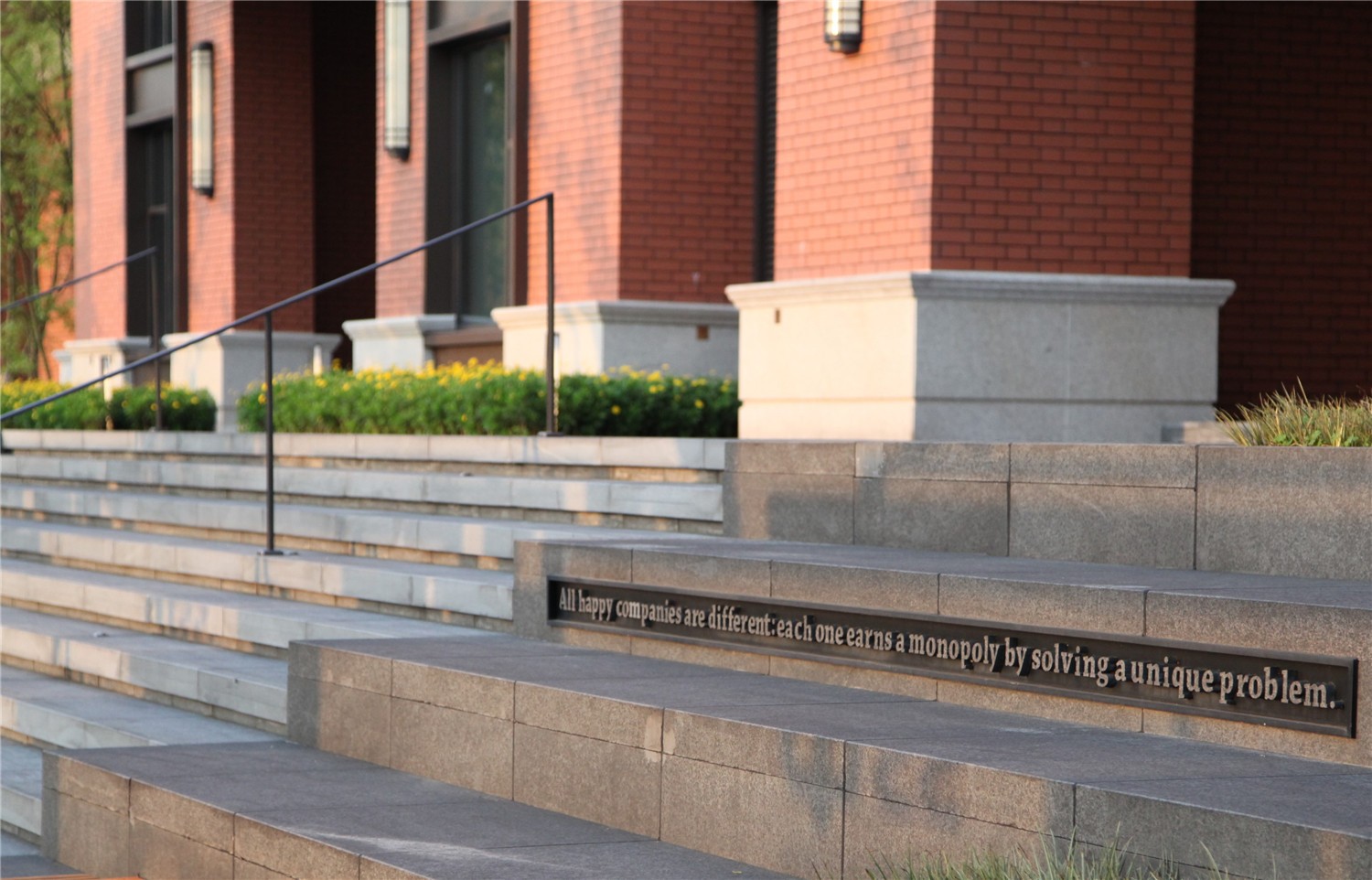
从商业主轴线到二三楼的屋顶庭院空间,只有两条夹在建筑立面的步行台阶可以到达,为了削减在两面高大的山墙之间行走的逼仄感,设计将台阶进行了艺术化的处理,在台阶的中断停留处设置雕塑,植入场所的文化理念,让台阶本身就成为一处视觉记忆和停留空间,再加上在屋顶庭院对景焦点处的景观引导,让整个行走变得趣味盎然。
From the main axis of the business to the roof courtyard space on the second and third floors, only two walking steps sandwiched between the facades of the building can be reached. In order to reduce the sense of walking between the two high gables, the design has artistically treated the steps , Set up a sculpture at the interrupted stop of the stairs, and implant the cultural concept of the place, so that the steps themselves become a visual memory and a stop space, plus the landscape guide at the focal point of the roof courtyard, making the whole walk interesting abundant.

设计亮点
Design highlights
入口广场
Entrance plaza
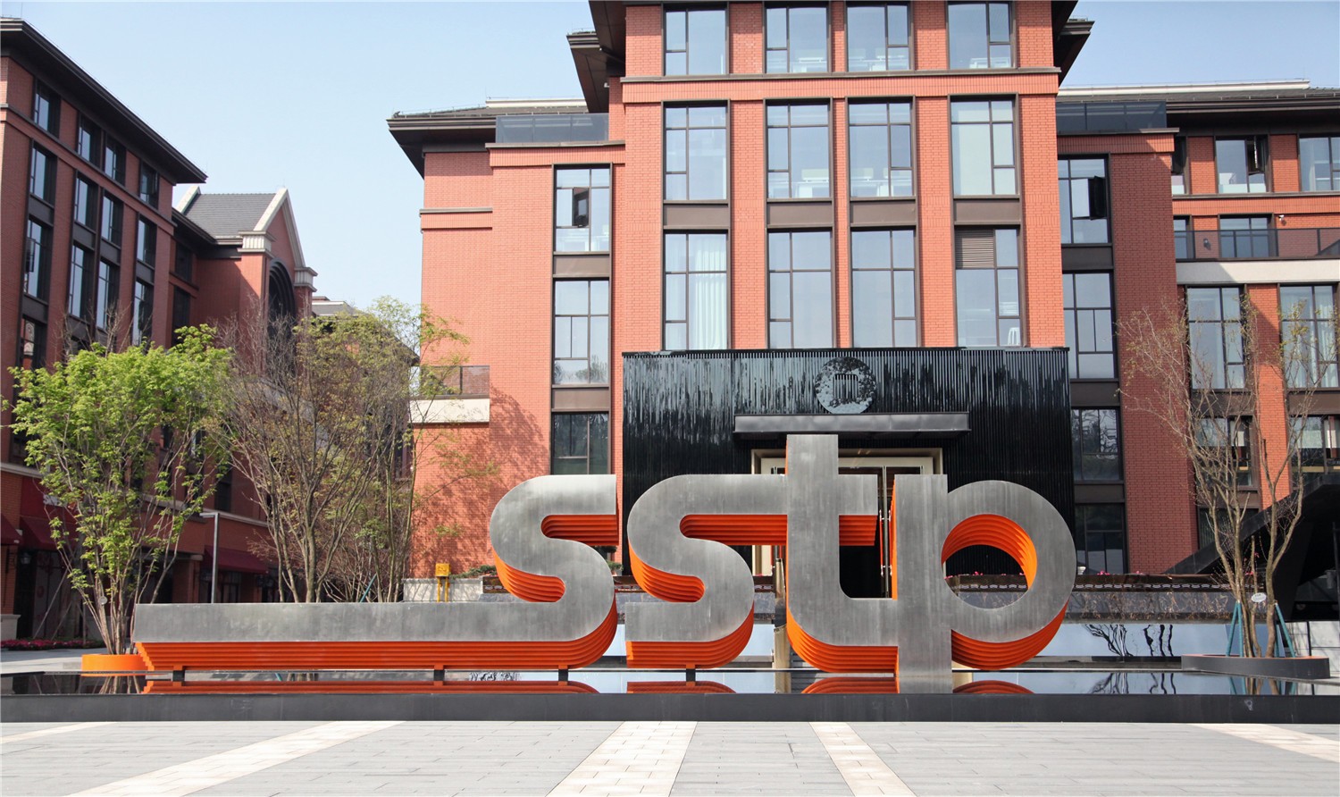
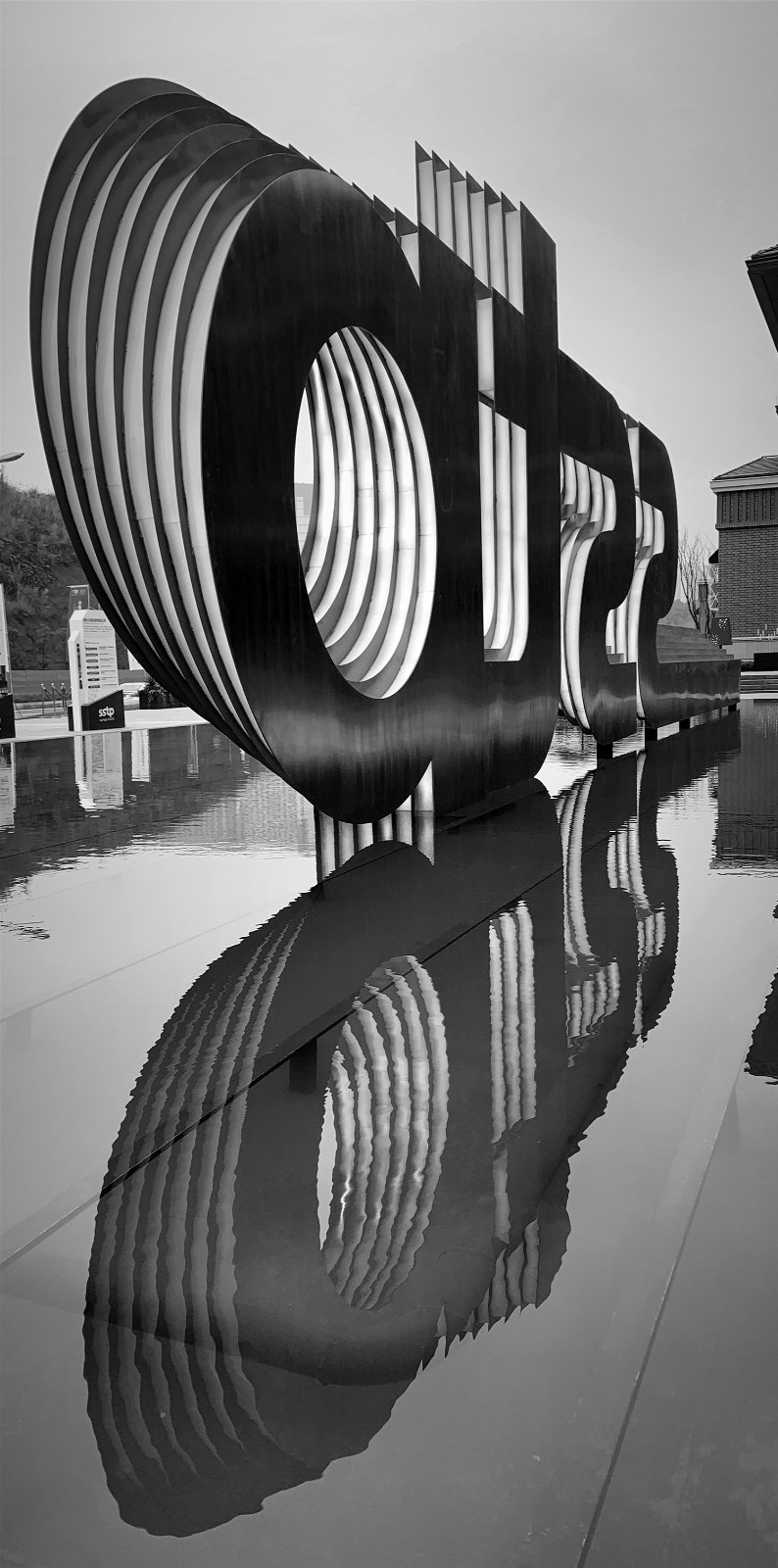
根据路口广场的尺度,我们设计了一处简洁大气的水景和项目logo。长15m,高4m,厚度1.2m的立体logo,由7层20厚的不锈钢板按相同的间距和相同的斜率进行错叠,正面以镜面不锈钢反射出周围的蓝天绿树,而侧面的橙色不锈钢层层的错叠,透露出这个场地活跃的色彩。池底的灯光经过精心的设计,在夜间呈现出星空般璀璨的色彩。
According to the scale of the intersection square, we designed a simple and atmospheric water feature and project logo. The three-dimensional logo is 15m long, 4m high and 1.2m thick. It is staggered by 7 layers of 20-thick stainless steel plates at the same interval and the same slope. The front surface reflects the surrounding blue sky and green trees with mirror stainless steel, while the orange stainless steel on the side Layers of staggering reveal the active colors of this venue. The lights at the bottom of the pool have been carefully designed to show the bright colors of the starry sky at night.
彩色庭院
Color courtyard
6个主题庭园在空间构成上有极大的相似度,都是由U形建筑体围合起来的中庭且被一条通道贯穿。在园区大气的线性构成基础上建构内庭的空间格局,设计特别重视开放空间的交流体验,便捷的交通,舒适的停留,以及独具特色的庭院家具,让每一个庭院都充满了生活化的办公场景。
The six theme gardens have a great similarity in spatial composition, and all are surrounded by a U-shaped building and are penetrated by a passage. Based on the linear composition of the park's atmosphere, the inner space is constructed. The design pays special attention to the open space communication experience, convenient transportation, comfortable stay, and unique courtyard furniture, so that each courtyard is full of living office. Scenes.
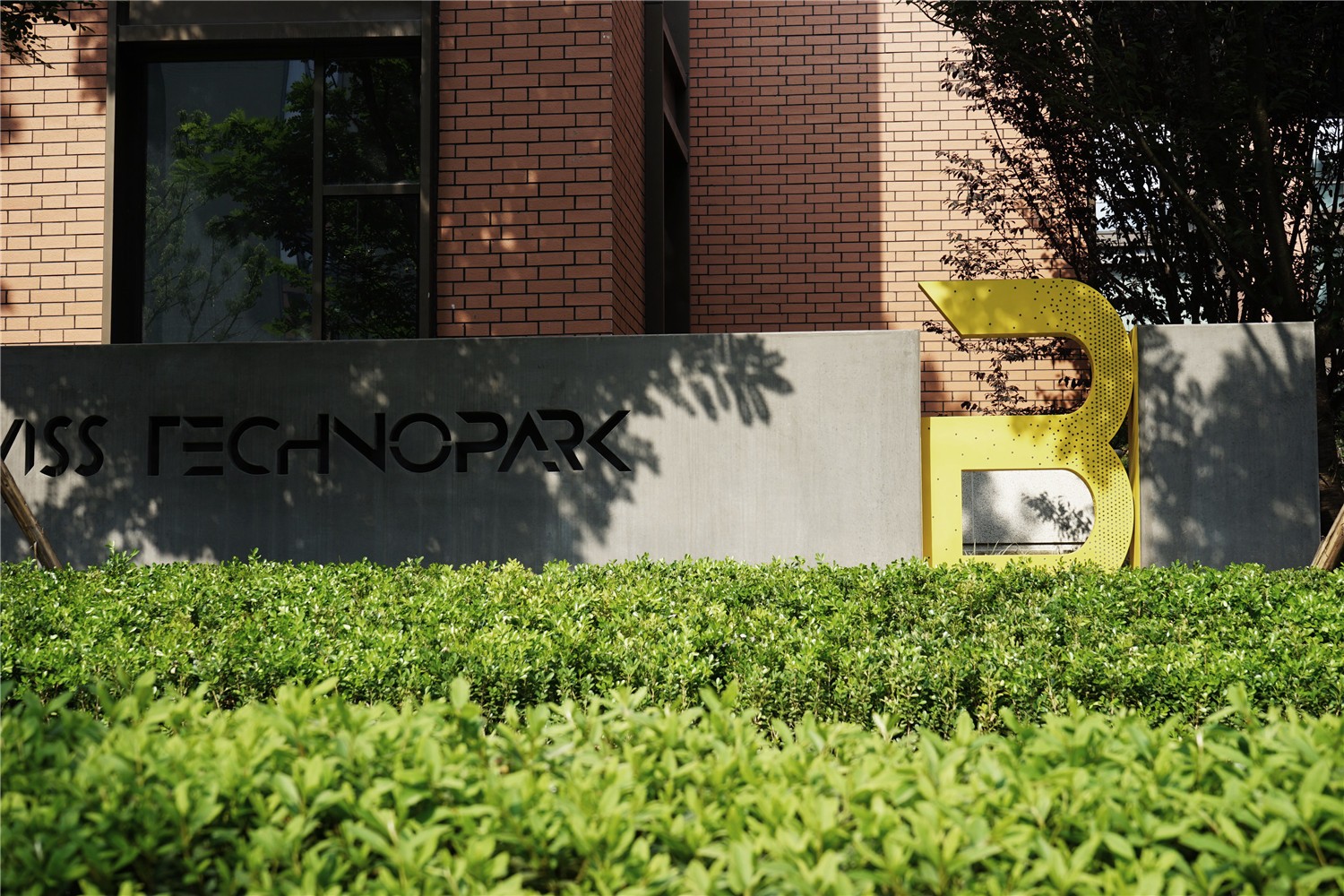
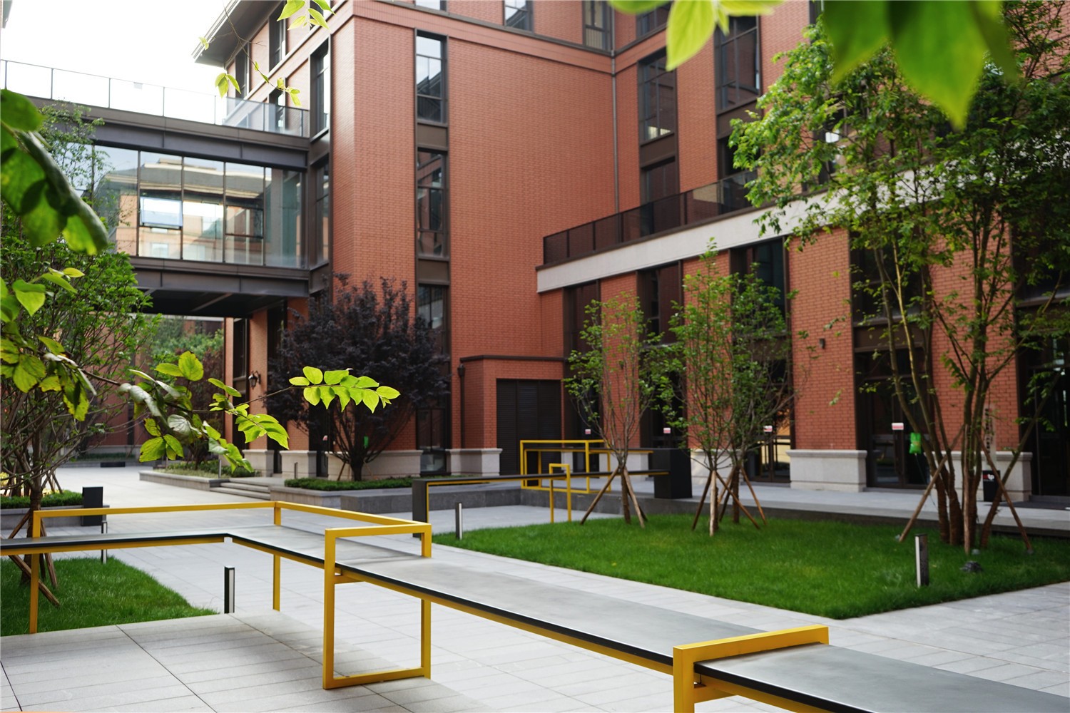
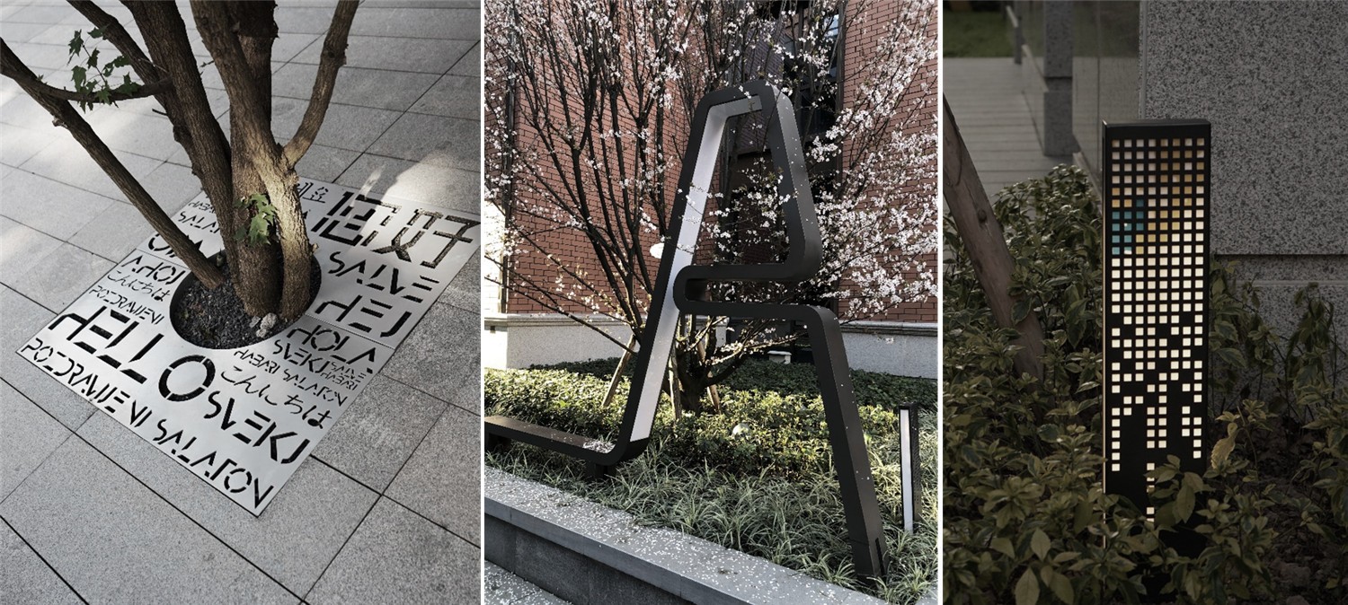
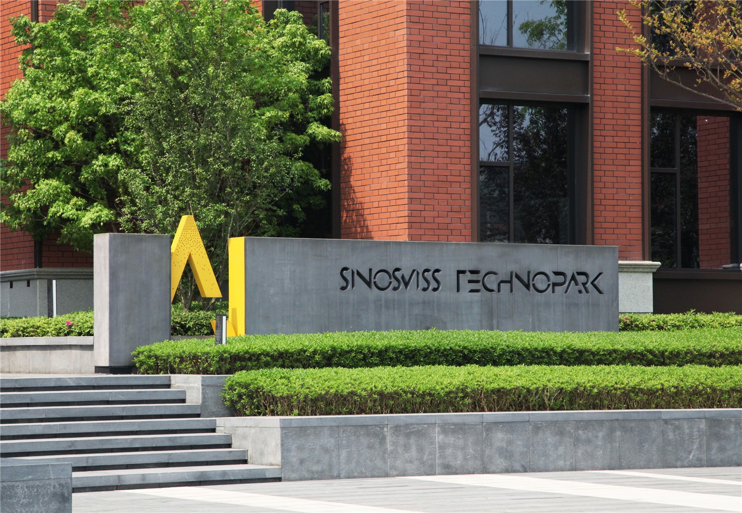
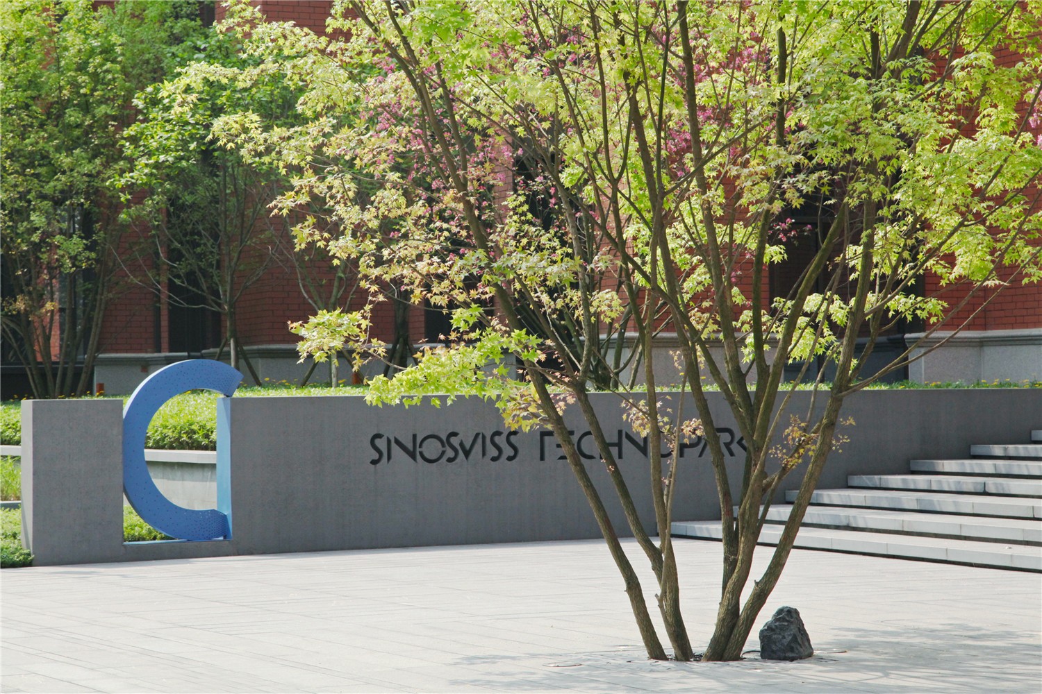
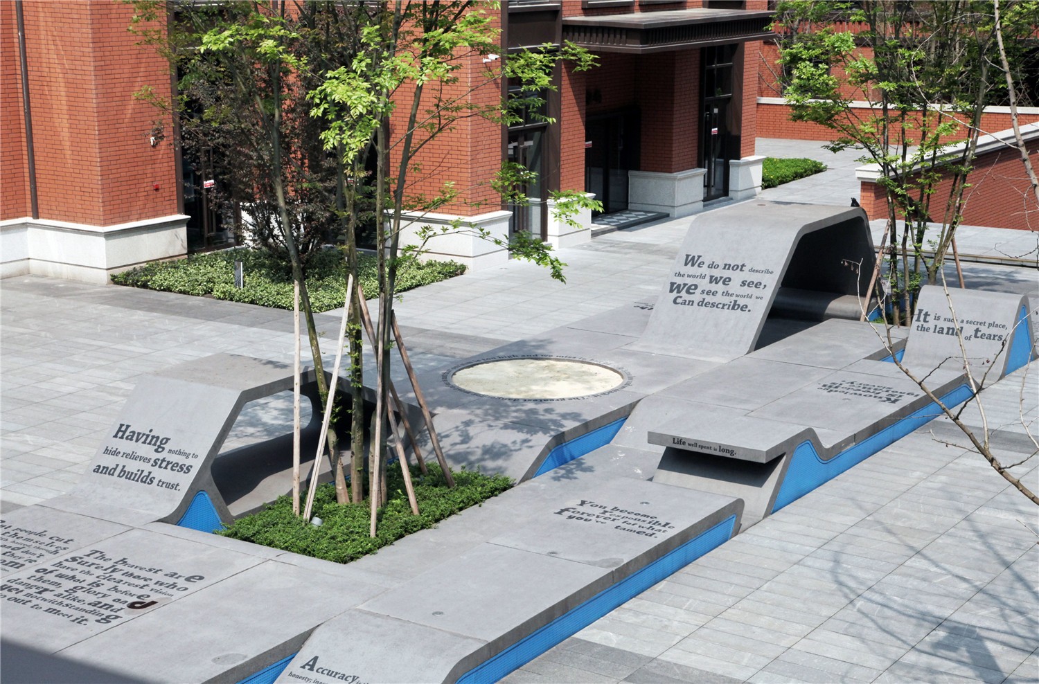
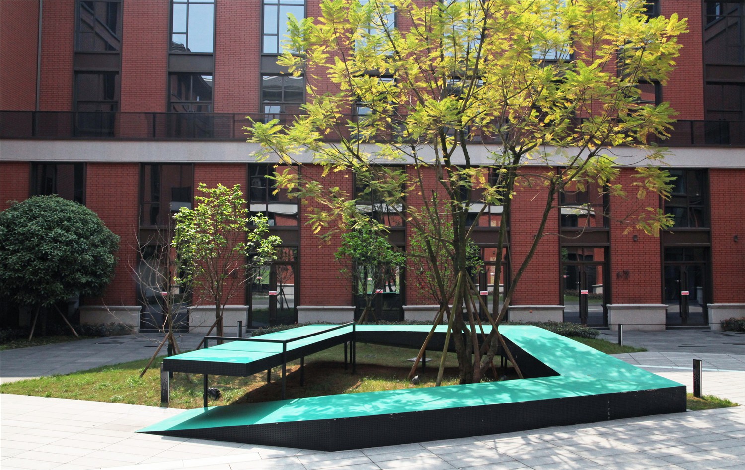
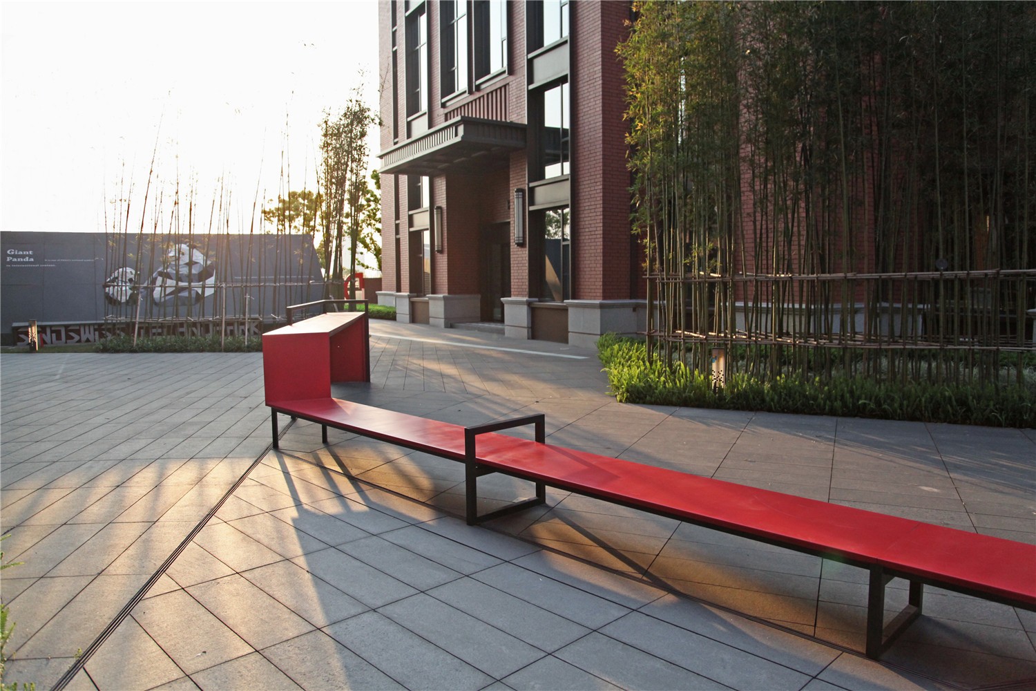
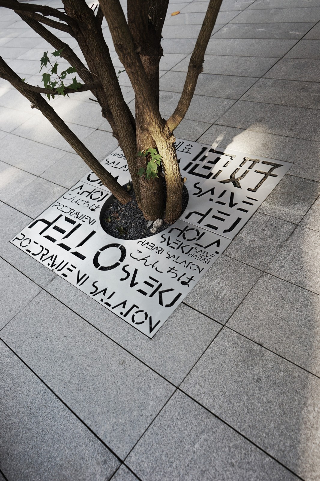
为了提升庭院的识别度,在整个园区简洁的黑灰调子基础上,设计通过导视、庭院家具、设施等色彩的变化为每个庭院赋予了不同的色彩和性格,比如开放庭院--黄色的活泼明亮,红色的热情奔放、蓝色的自由乐趣,绿色的和谐静谧,每个庭院围绕自己的主色与性格进行深入的空间氛围设计,让原本的相似的空间因此变得多元和个性清晰。
In order to improve the recognition of the courtyard, based on the simple black and gray tones of the entire park, the design gives each courtyard a different color and personality through the color changes of guides, courtyard furniture, facilities, etc. For example, the open courtyard-yellow Lively and bright, passionate and unrestrained in red, free and fun in blue, harmonious and quiet in green, each courtyard is designed with an in-depth space atmosphere around its main color and character, so that the original similar spaces become diverse and clear.
中心路口
Central intersection
在两条主轴线交汇处,设计选择以一个象征万物关联与平衡艺术雕塑形成视觉中心聚焦点,形成一处开放的中心小广场,既体现了空间的自由和艺术气质,也增添了几分趣味。
At the intersection of the two main axes, the design chooses to form a visual center focus point with an art sculpture that symbolizes the relationship between all things and balances, forming an open central small square, which not only reflects the freedom of space and artistic temperament, but also adds a bit of fun .

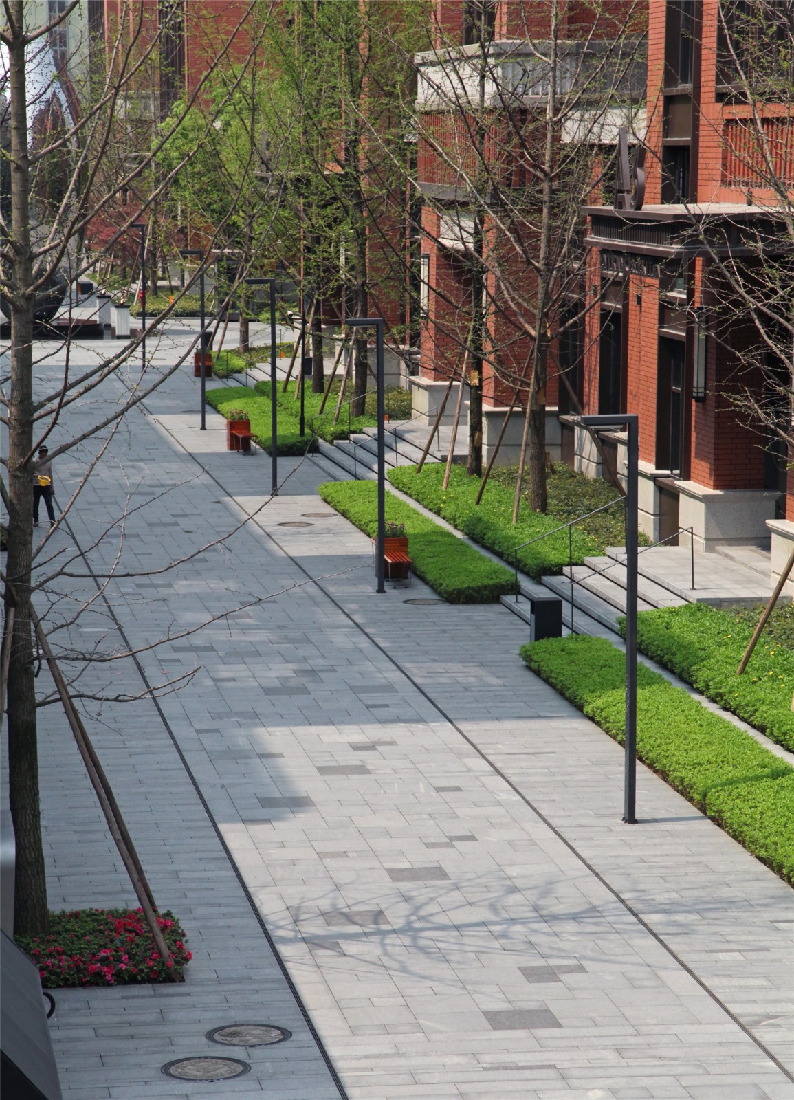
本着最大限度打通场地脉络,融合建筑内外的空间,充分理解国际化的行为习惯及审美偏好,全面提升空间活力的原则,设计为园区展现了一个时尚品质的项目形象,为使用者提供了一个多元精彩的交流空间,也为城市增加了一个充满艺术的活力场所。
Based on the principle of maximizing the site context, integrating the space inside and outside the building, fully understanding the international behavior habits and aesthetic preferences, and comprehensively improving the vitality of the space, the design shows a fashionable quality project image for the park and provides users with a Diversified and wonderful communication spaces also add a vibrant place full of art to the city.

版权声明:本文由作者于江南电竞官网登录入口 网发布,仅代表作者观点,不代表江南电竞官网登录入口 网立场。如转载、链接、转贴或以其它方式使用本稿,需注明“文章来源:江南电竞官网登录入口 网”。如有侵权,请与发布者或我们联系。
投稿邮箱:contact@landscape.cn
项目咨询:18510568018(微信同号)


