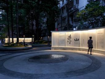
广州东山少爷南广场社区公园改造景观设计 | 哲迳建筑师事务所
-
项目名称:东山少爷南广场社区公园改造
-
项目地点:广州越秀区东华东路与龟岗大马路交界,三路车总站西侧
-
项目规模:898㎡
-
设计公司:
-
委托方:广州市越秀区商务局
-
图片来源:吴嗣铭
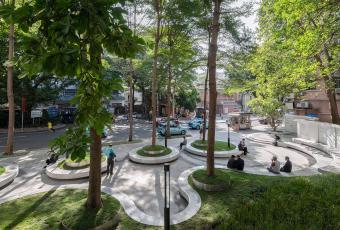
东山少爷广场位于广州市越秀区东山口非常独特的位置,一直以来都是东山口商业活力轴与居民生活轴的交汇点,也是公交站点的始发点与终点,更是人们搭乘地铁前往新河浦历史保护片区必经的城市公共节点场所。
Dongshan Shaoye Plaza (Dongshan Young Master Park) is located in a very unique location in Dongshankou, Yuexiu District, Guangzhou. It has always been the intersection of Dongshankou’s commercial vitality axis and residents’ life axis, and the starting point and ending point of the bus terminal. It is also a public node place that people must pass through when going to the Xinhepu Historic Preservation Area by subway.

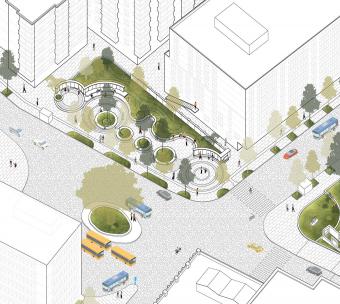
▲项目概览,overall of the project © 吴嗣铭

© 吴嗣铭
东山少爷广场2000年经历过一次整饰翻新,十年过去,植物依旧绿意盎然,但广场整体使用品质低下,使用人群单一,公共维护不到位导致景观构筑物区变得消极,成了卫生黑点与治安盲区。
Dongshan Shaoye Plaza ( Dongshan Young Master Park) underwent a renovation in 2000. Ten years later, the plants are still full of vigor , but the overall quality of the square is low that limits the composition of the crowd, and inadequate public maintenance has caused the landscape structure area to become negative, which makes the park become a hygiene loophole and security blind spots.
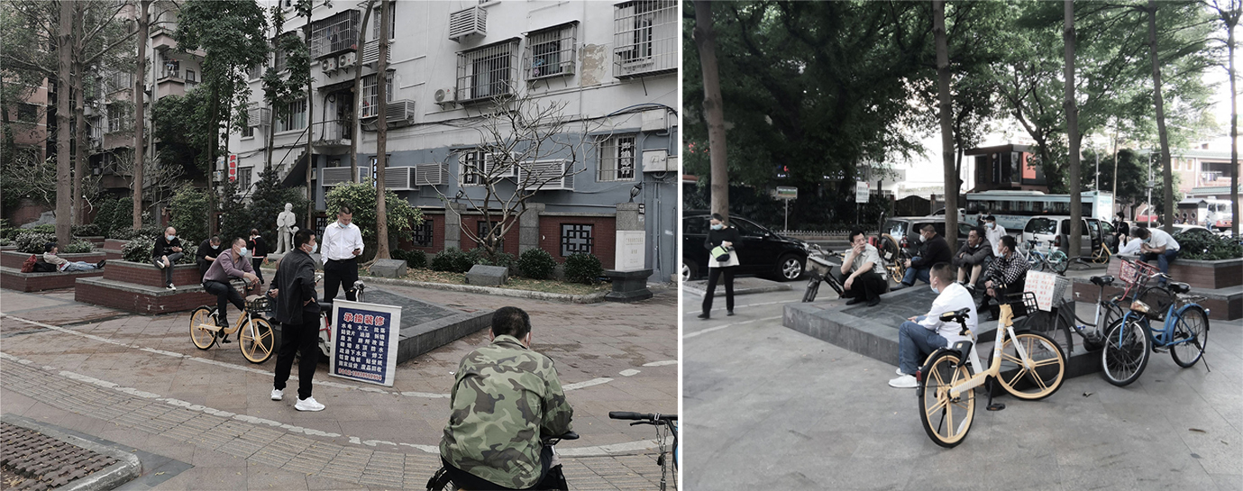
▲ 东山少爷南广场改造前
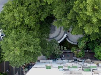
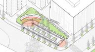
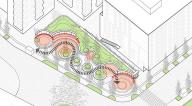
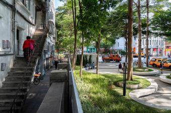
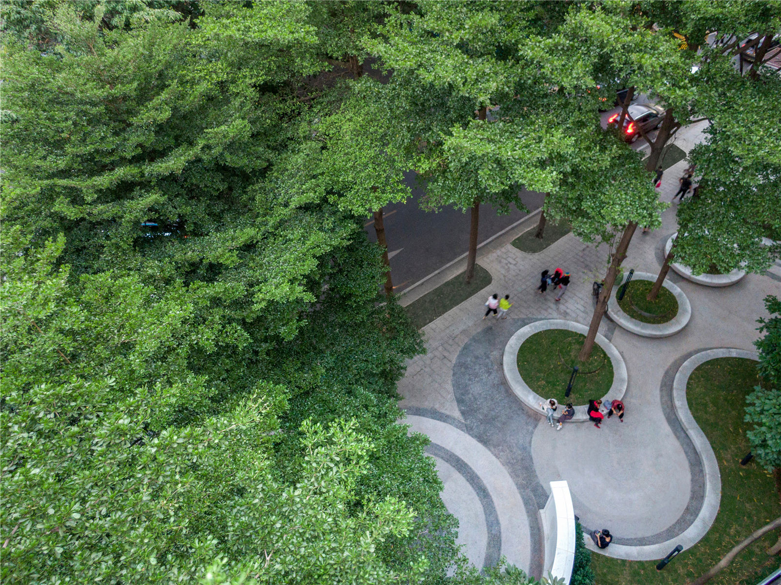
场地流线由枯燥的直线变为更富有探索性趣味的曲线。
本次提升改造的目标是能够令更多的社区居民能像使用自家客厅一般使用这个公共场所,即自在又自豪,同时能吸引更多的外来游客通过广场游历了解到广州东山地域文化。最终,因为使用人群的增加与多元化,年轻活力与文化传递被点燃,真正激活从一个社区公共节点到下一个社区公共节点的能量传递。
The circulation of the site has changed from a boring straight line to a more exploratory and interesting curve. The goal of this upgrade is to enable more community residents to use this public place like using their own living room, that is comfortable and proud, and to attract more foreign tourists to learn about the regional culture of Guangzhou Dongshan through the square tour. In the end, because of the increase and diversification of the user population, the youthful vitality and cultural transmission are ignited, and the energy transmission from one community public node to the next community public node is truly activated.

▲将直线型广场流线改为曲线型 © 哲迳建筑师事务所


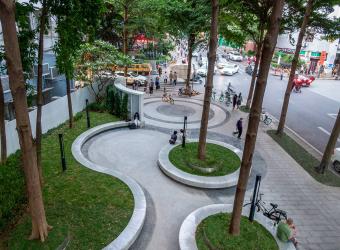
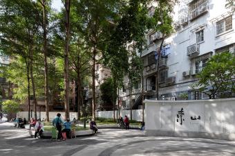
▲周边环境与公园形成生动的城市生活图景 © 吴嗣铭
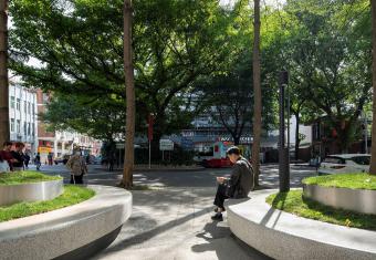
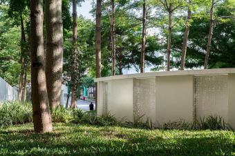
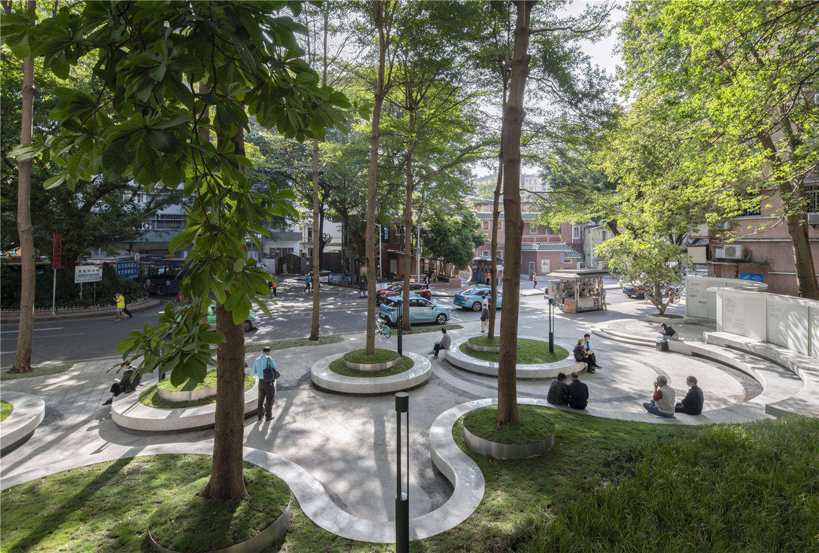
东山少爷广场的景物与人物共同构建了一幅幅立体的,随时间变幻的空间画面,其中树木起到了非常重要的空间限定作用。小叶榄仁枝干分明,叶片不重叠的特性令阳光有层次地透过,斑驳撒落于地面。人在下部活动,视野通畅。光线经过叶子过虑形成自然美丽的光型图案,空气流畅而不急速,一份舒适而静谧的感觉油然而生。
The scenery and characters of Dongshan Shaoye Plaza (Dongshan Young Master Park) together construct a three-dimensional, time-changing spatial picture, in which trees play a very important role in limiting space. Madagascar almond have distinct branches, and the non-overlapping leaves allow sunlight to pass through in layers and dappled on the ground. People move in the lower part and have a clear vision. The light passes through the leaves to form a natural and beautiful light pattern. The air is smooth and not fast, and a feeling of comfort and tranquility emerges spontaneously.


© 吴嗣铭
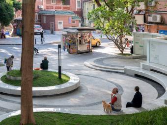
东山少爷广场有优秀的树顶遮蔽形成的稳定空间感,有树干作为轨迹参考形成天然的流动感,唯独缺少了树干下面的另一个层次,让人坐下来与之静静相处的内容——草地。草地不处于人的脚底,而是“浮起来”,跟人的坐高一致。使用者在坐下时,因为没有背靠的原因,也因为树池尺度的原因,会无意识地向后靠,触碰到草坪。为了让使用者能更关注到草坪的存在,设计师刻意分出另一个高程,把草坪托举在亮眼的不锈钢圈上,精致地“捧”到了人的眼前。
The Dongshan Shaoye Plaza (Dongshan Young Master Park) has a stable sense of space formed by the excellent tree-top refuge. The tree trunk is used as a reference for the formation of a natural flowing trajectory, but under the tree trunk there is a lack of layering, allowing people to sit down and get along with the content-Grass. The grass is not at the bottom of a person’s feet, but “floating” to match the height of the person’s sitting posture. When sitting down, due to the lack of a backrest or the scale of the tree pond, the user will unconsciously lean back and touch the lawn. In order to make users pay more attention to the existence of the lawn, the designers deliberately distinguished another elevation, keeping the lawn on a bright stainless steel circle, and then “holding” it to people’s eyes.
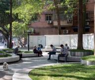
场地上人们独自休闲,三两成趣,低声细语。空间的流动感与人的离散感,区域限定感一并构成了既矛盾又互补的场域变奏曲。这种自然的流畅与变奏与几何线性的形式语言似乎有先天的匹配优势,流畅自然变奏生趣。
On the park, people were relaxing alone, or whispering two-by-two. The sense of flow in space, the sense of separation of people, and the sense of regional limitation together constitute a contradictory and complementary “space variation”. This kind of natural fluency and variation and geometric linear formal language seem to have an innate matching advantage, and the fluency and variation are interesting.


▲树顶遮蔽形成的稳定空间感© 吴嗣铭
石材的光面带来犹如水面般对于上部树冠,上部绿意光斑的丰富反影。光洁的质感与弧线的形式语言相搭配,一条浮起来的光影彩带,让原本安静的场所添加了一笔曼妙。
The smooth surface of the stone brings a rich reflection of the upper canopy and green spots on the upper part of the tree just like the water surface. The smooth texture is matched with the formal language of the arc. A floating ribbon of light and shadow adds a touch of grace to the originally quiet place.

▲ 与树冠相呼应的石材铺装
城市家具在树荫构建的空间场景中,更像是在弥补低区的空间功能,而不是单纯的,传统意义的作为一种使用功能存在。它们即是坐凳,也是树池,即是开放的公共城市家具,也是空间围合道具,即是行走限定彷如“栏杆”,也是孩童可以踩踏奔跑的“赛道”。
In the space scene constructed by the shade of the trees, urban furniture is more like compensating for the space function of the low area, rather than simply, it exists as a use function in the traditional sense. They are both stools and tree ponds, which are open public urban furniture and space enclosure props. They are restricted to walking like “rails”, and they are also “race tracks” where children can step on and run.
场地上部疏透绿色叶片与光线组合的图案感一直是设计师想重点呈现给市民的美好景象。一道光带,一片剪影,一丝灵动……最终设计师把目光聚焦在即作为坐凳同时作为花池围挡的城市家具上。
he pattern of the combination of transparent green leaves and light on the upper part of the site has always been a beautiful scene that the designer wants to present to the citizens. A strip of light, a slice of silhouette, a touch of agility...Finally architects focused his attention on the urban furniture that serves as a stool and a flower pond.


▲城市家具围合出小剧场 © 吴嗣铭
设计师还额外关注到草坪在日夜更迭中的场景变化,夜幕降临,景观照明光晕越发明显,一滩一滩自然散落在弧形的坐凳上。下班高峰时段过去,城市节拍慢下来,逐渐放下忙碌心情的人们放缓脚步,在这里享受片刻惬意,享受暖光下草坪给予的温柔治愈。场地上部疏透绿色叶片与光线组合的图案感一直是设计师想重点呈现给市民的美好景象。一道光带,一片剪影,一丝灵动……最终设计师把目光聚焦在即作为坐凳同时作为花池围挡的城市家具上。
Architects also pays extra attention to the changing scenes of the lawn during the day and night. As night falls, the halo of landscape lighting becomes more and more obvious, naturally scattered on the curved benches. After the rush hour after get off work, the city beat slowed down, and people who gradually let go of their busy mood slowed down, enjoy a moment of comfort here, and enjoy the gentle cure given by the lawn under the warm light. The pattern of the combination of transparent green leaves and light on the upper part of the site has always been a beautiful scene that the designer wants to present to the citizens. A strip of light, a slice of silhouette, a touch of agility…Finally architects focused his attention on the urban furniture that serves as a stool and a flower pond.

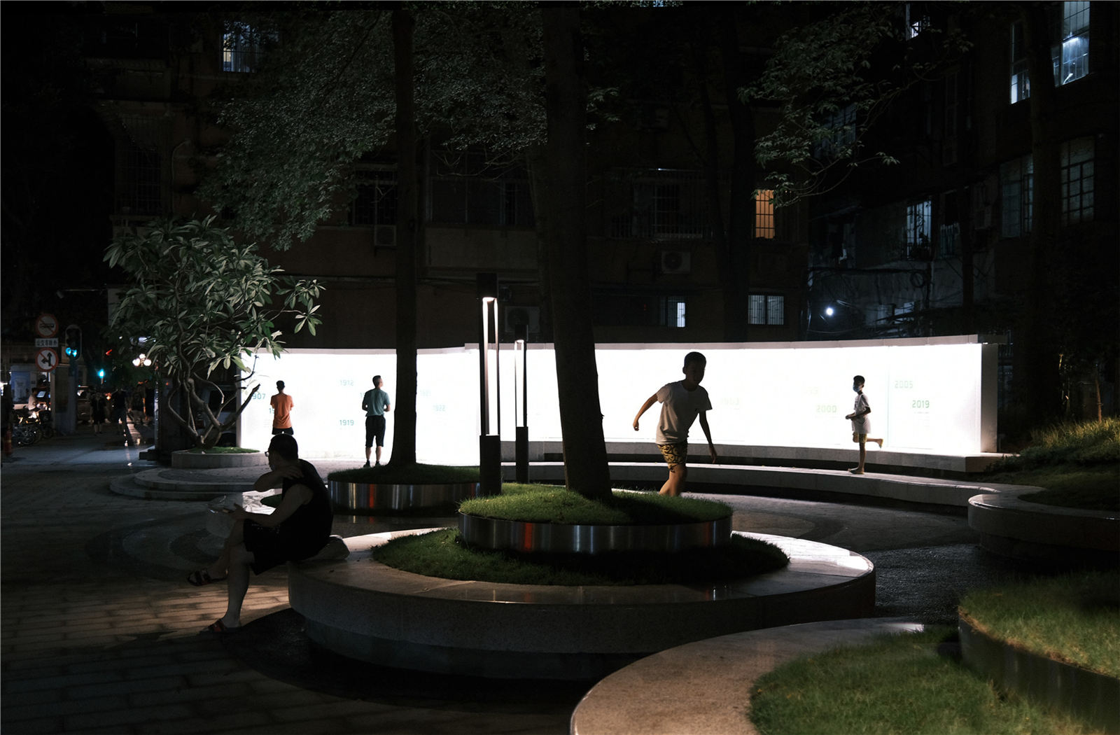
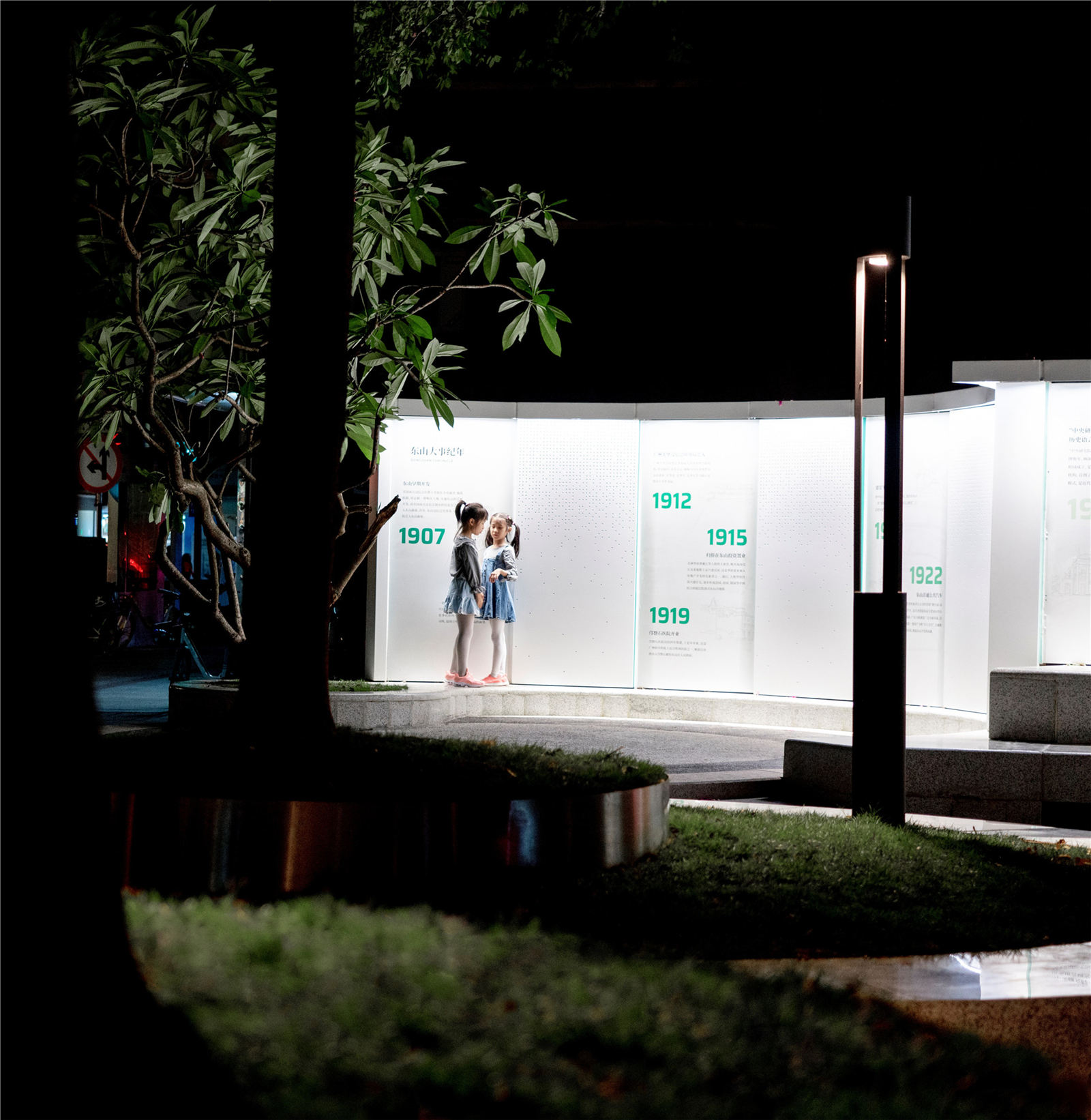
场地的模样显然不是被设计师空想出来的,而是场地使用者自发构成了它的初始基因,经过设计者与管理者对多元属性的合理添加,置入时间的变量,并以长期维护,共同监督的使用方式来引导出来的。这样的场地才会在改造后长久获得市民的喜爱,发挥出除了美以外的,更契合未来城市发展变迁的多元使命。
Obviously, the appearance of the site was not imagined by the architect, but the site users spontaneously constituted its initial genes. After the architects and managers have rationally added multiple attributes, the variables of time have been put in, and long-term maintenance is implemented. The way the supervision is used is guided. Only such a venue will be loved by the public for a long time after the renovation, and will play a diverse mission that is more in line with the development and changes of the future city in addition to beauty.
项目名称:东山少爷南广场社区公园改造
设计方:哲迳建筑师事务所
公司网站:http://way-a.com/
联系邮箱:993920319@qq.com
标签:广州 改造 城市更新
分类:公共空间 公园
项目设计 & 完成年份:2020.3 / 2020.9
主持建筑师:王宁、方斐
项目建筑师:林庄,张祖德
设计团队:黄伟朋、范彦钰、梁晋铭、罗智、黄芸衡(实习生)
现场设计代表:张祖德/范彦钰/黄伟朋
项目地址:中国广州越秀区东华东路与龟岗大马路交界,三路车总站西侧
建筑面积:898㎡
摄影版权:吴嗣铭
合作方:LIGHTHOUSE灯塔文化(文化标示设计)
客户:广州市越秀区商务局
品牌:凯撒白麻花岗石 绿植 金属
石材:云浮市焯诚石业有限公司
铝板:广州市富腾建材科技有限公司
灯具:中山市轩昂照明器材有限公司、广东雷狮光电技术有限公司
不锈钢:中山市胜德设计装饰工程有限公司
Project name:Dongshan South Square community Park renovation
Design:WAY Architects
Website:http://way-a.com/
Contact e-mail:993920319@qq.com
Design year & Completion Year:2020.3 / 2020.9
Leader designer:Keven Wong、Fanmie
Creation Architect :John.Lin、Steven
Team:Weipeng Huang、Yuri、Moses、Lookie、Yuni Chen(trainee)
Site Supervisor:Steven、Yuri、Weipeng Huang
Project location:Guangzhou· China
Gross Built Area (square meters):898㎡
Photo credits:Siming Wu
Partners:LIGHTHOUSE
Clients:Guangzhou Yuexiu District Commerce Bureau
Brands / Products used in the projrct:Caesar white hemp granite、glass、metal
版权声明:本文版权归原作者所有,如有侵犯您的权益请及时联系,我们将第一时间删除。
投稿邮箱:info@landscape.cn
项目咨询:18510568018(微信同号)
