武汉平和坊百年历史街区景观及室内公区设计 | UAO瑞拓设计
-
项目名称:平和坊百年历史街区景观及室内公区设计
-
项目地点:武汉
-
设计公司:
-
图片来源:UAO瑞拓设计 / 赵奕龙 / 贾然
历史
History
项目处于汉口原英租界区内,场地内有数栋百年历史保护建筑。城市化的进程,带来了原有租界地块建筑功能的转变;始建于1905年的平和打包厂,原来是英商利德尔兄弟创立的平和洋行的棉花打包仓库;改革开放之后,分散出租作为旅馆、酒吧、仓储等各种功能。新的改造设计,则将之整合改造、转换成为文化创意产业园区。
The project is located in the former British leased area of Hankou where there are several century-old proteced buildings. The process of urbanization has brought about the transformation of the building functions of the original concession plots. Built in 1905, the Pinghe Packaging Factory, originally was a foreign cotton packaging warehouse founded by the British business Liddell Brothers; After the reform and opening-up, it was scattered and rented out as hotels, bars, warehouses and other functions. The new transformation design will integrate and transform it into a cultural and creative industrial park.
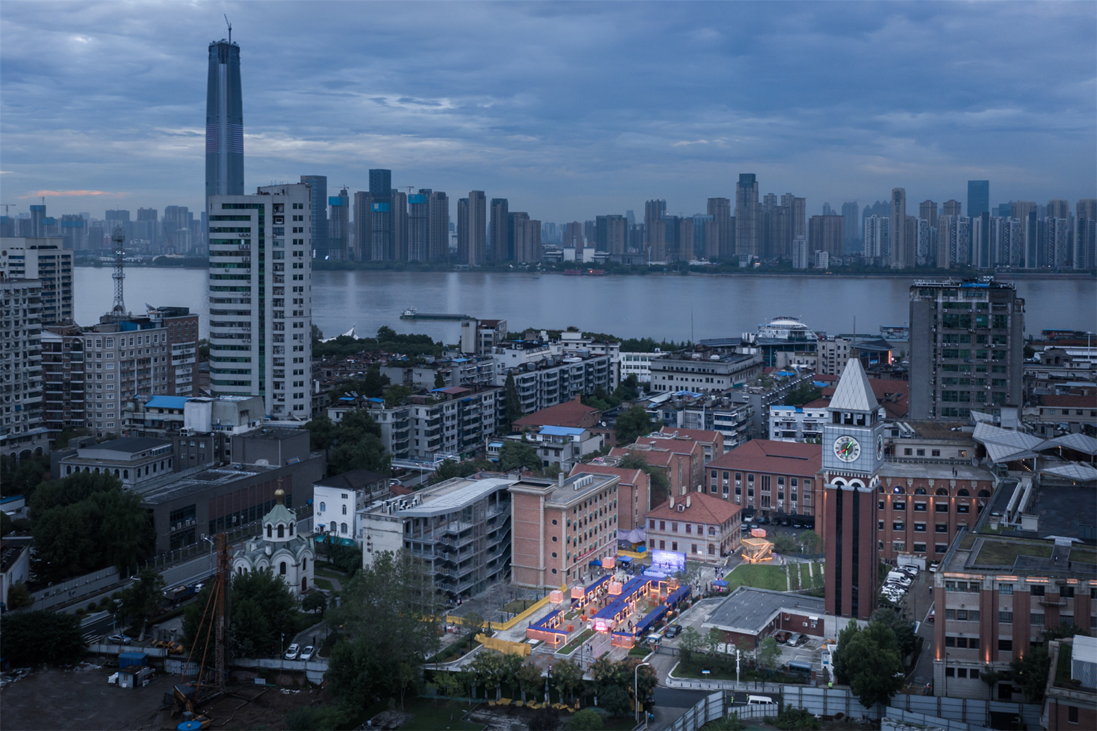
▼夜景鸟瞰
Aerial night view ©赵奕龙
▼项目概览
Overall of the project © 赵奕龙
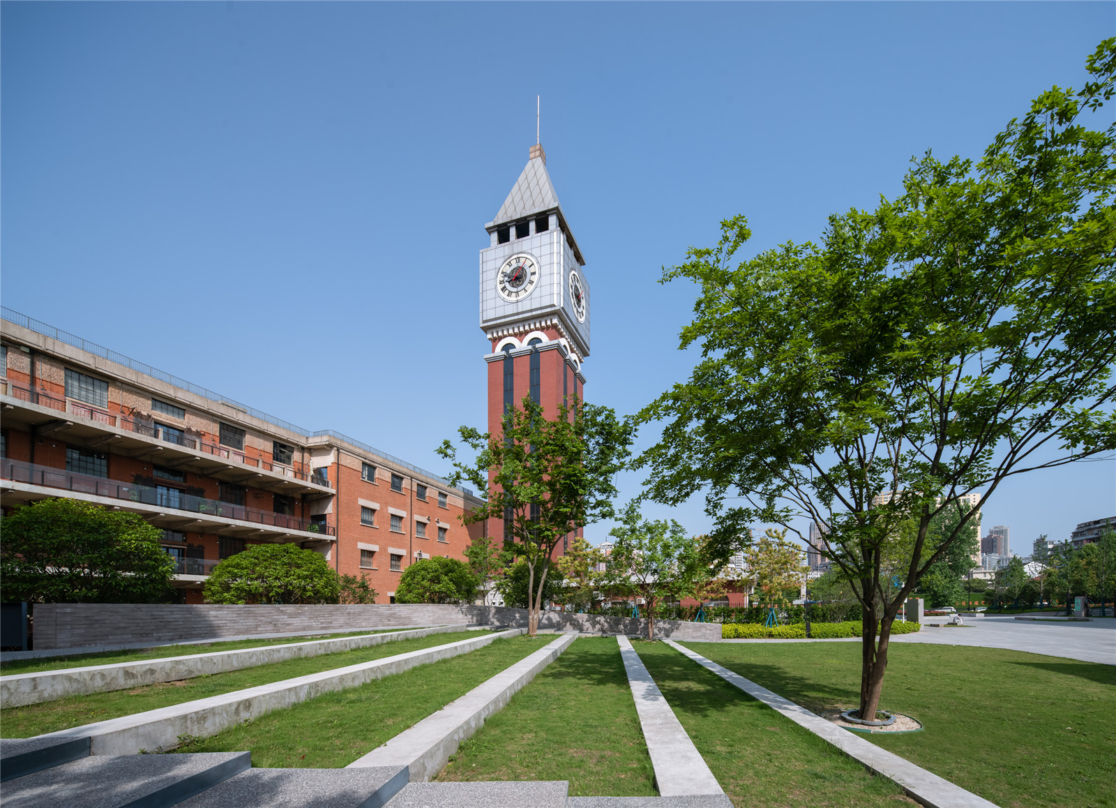
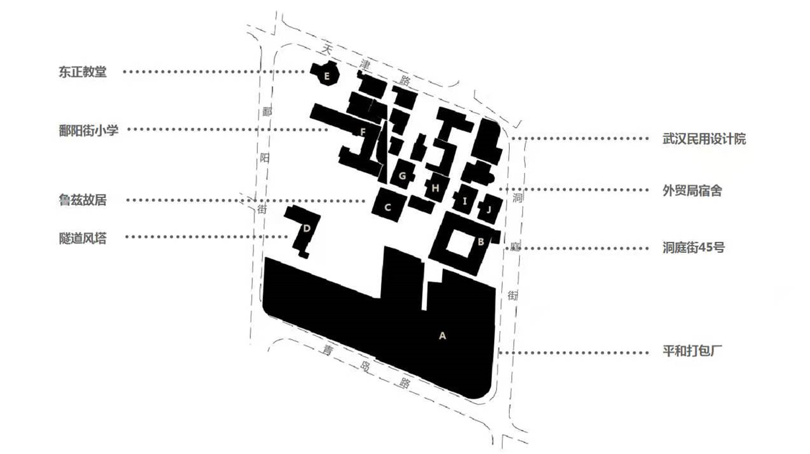
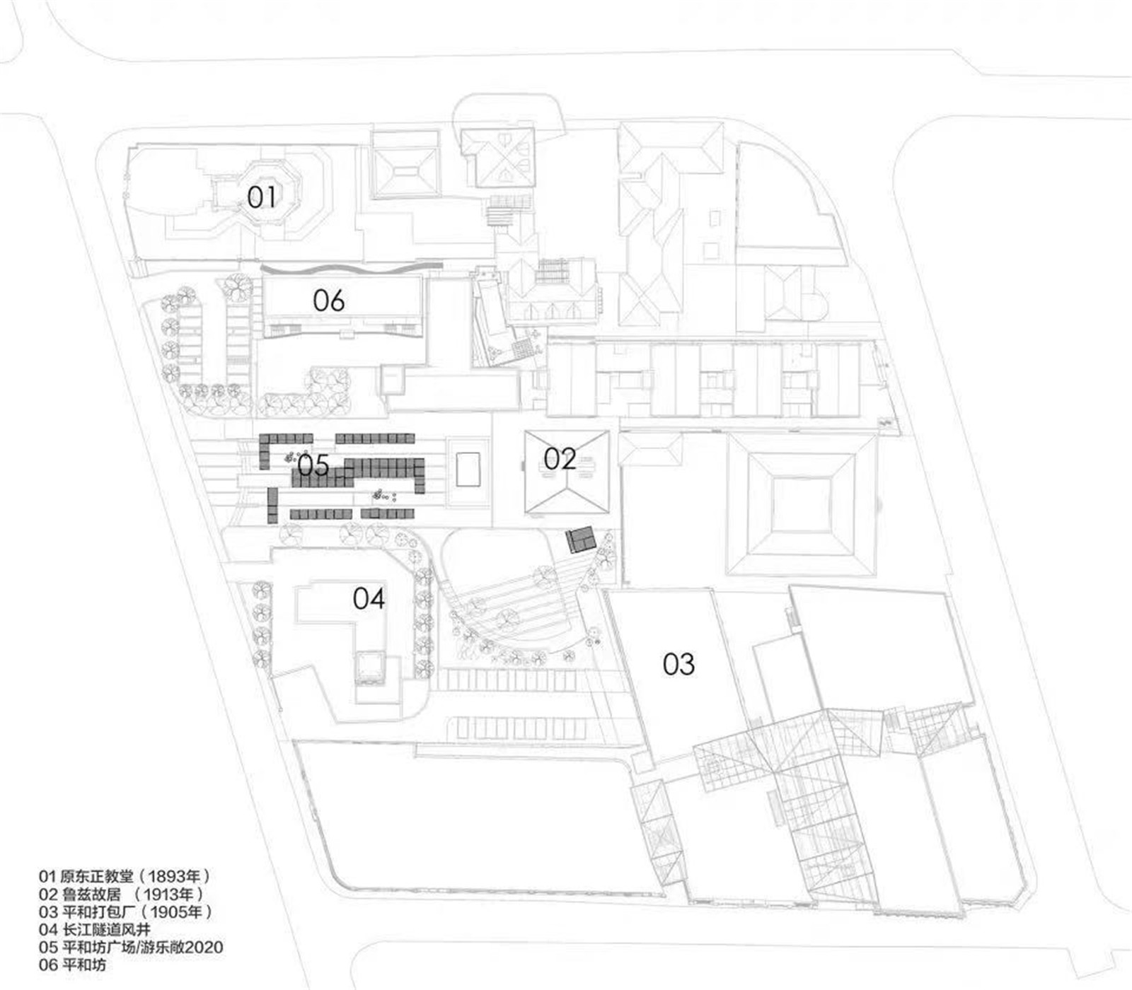
场地中心位置是建于1913年的鲁兹故居(解放前为主教住所,现在是江岸区博物馆);而项目现场中央的空地,原来的教堂建筑因为修建长江上第一条过江隧道已被拆除;这个空场地被几个权属单位各自分割成自己的小院子:鲁兹故居周边的院子成为博物馆室外收藏的堆场;围绕长江隧道的通风竖井的院子占据着大部分沿胜利街的空间,通风竖井被建成仿古钟塔的造型,成为场地中一个最高的构筑物,具有无可置疑的标志性。
The center of the site is the former residence of Lutz, which was built in 1913 (It was the bishop's residence before liberation, and is now the museum of the riverbank district). And in the central space of the project site, the original church building has been removed for the construction of the first tunnel across the Yangtze River. The vacant lot was divided into small courtyards by several ownership units: The courtyard around Lutz’s house has become a outdoor repository for the museum’s collection; The courtyard around the ventilation shaft of the Yangtze River Tunnel occupies most of the space along Shengli Street. The ventilation shaft has been built in the shape of an ancient bell tower, becoming one of the tallest structures in the site and an unmistakable landmark.
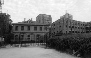
▼改造前的和平坊与周边的历史建筑
The site before renovation and the surrounding historical buildings ©UAO瑞拓设计
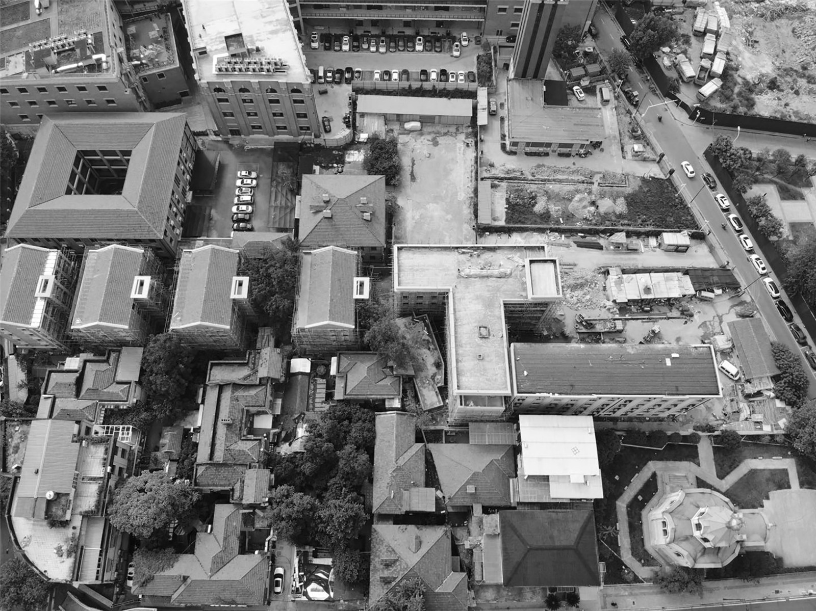

场地北侧外贸局宿舍和原鄱阳街小学早已腾退,原来的院墙将场地分成更细小的、互不相通的空间格局。场地西北角则是建于1893年的俄国东正教堂,它独自占领着地块道路转角的一个位置,在几年前的改造过程中,它也形成了自己独立的一个院落空间。场地周边的四条道路之外,百年历史保护建筑环伺:圣教书局、景明洋行大楼、保安洋行大楼、麦加利银行、叶蓬故居、沙逊洋行等。这些历史建筑风格各异,它们与地块内的平和打包厂一起,共同形成了原英租界建筑群的城市面貌和肌理。
On the north side, the dormitory of the Foreign Trade Bureau and the original Poyang Street Primary School have long been vacated, and the original courtyard wall has divided the site into a smaller and mutually isolated spatial pattern. On the northwest corner of the site is the Russian Orthodox Church built in 1893, which occupies a position on the corner of the road. During the renovation process a few years ago, it also formed a courtyard space of its own. In addition to the four roads around the site, the century-old preservation buildings are surrounded by Shengteaching Bureau, Jingming Foreign Bank Building, Bao’an Foreign Bank Building, Mechali Bank, Ye Peng’s Former Residency, Shaxun Foreign Bank, etc. These historic buildings are of different styles, and together with the Ping Ping packaging plant on the site, they form the urban appearance and texture of the original British Concession complex.
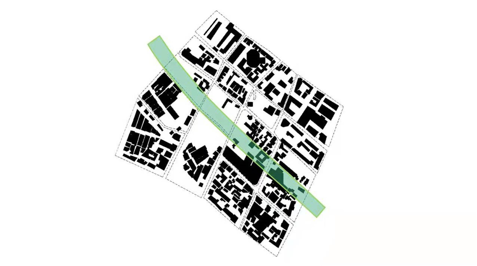
▼场地分析图
Site analysis diagram ©UAO瑞拓设计
轴线
Axis
景观设计的第一步就是延续这个区域的城市肌理,通过梳理地块的功能和空间布局,整合织补原来零碎分割的场地空间,从而响应城市规划对本区块的城市轴线要求。这个城市轴线并不是在英租界时期形成的,而是因为长江隧道明挖法施工而形成的一个垂江的通道。这个通道不得已破坏了原有租界区的肌理和密度,但从另外有利的一面来看,它又提供了高密度街区难得的公共绿地空间,兼顾了垂江绿廊的功能,将来也会和武汉长江岸边的汉口江滩公共绿地发生连接。
The first step of landscape design is to extend the urban texture of this area. By sorting out the functions and spatial layout of the plots, the original fragmented space is integrated and knitted, so as to respond to the urban axis requirements of this area in urban planning. The axis of the city was not formed during the British Concession, but as a conduit to the Yangtze River due to the open-cut construction of the tunnel. This passage destroyed the texture and density of the original concession area, but from the other side, it provides a rare public green space in the high-density block, and has the function of a green corridor hanging along the river. In the future, it will also connect with the public green space of Hankou River Beach on the bank of the Yangtze River in Wuhan.
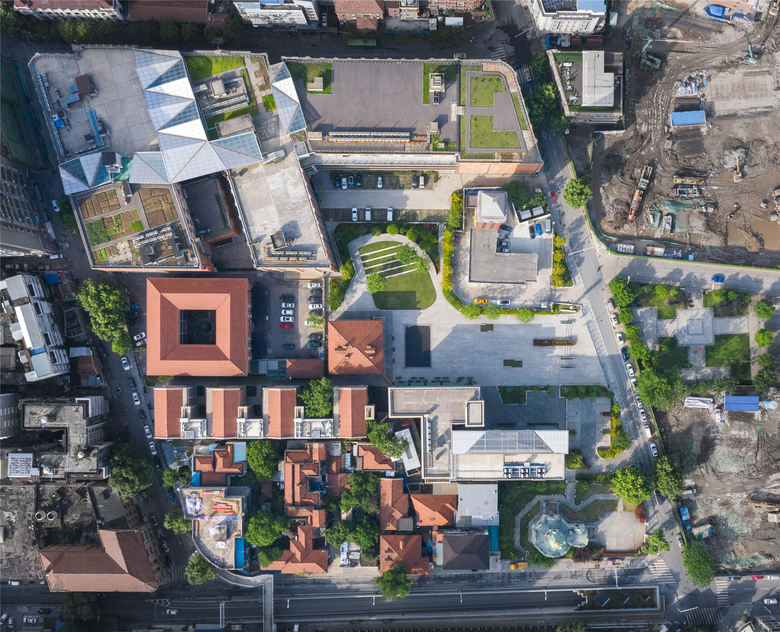
▼改造后的平和坊鸟瞰
Aerial top view of the project ©赵奕龙
织补
Darning
打通垂江绿廊轴线的第一步,就必须拆除地块之间的围墙,织补原来被分割成各个小权属的地块,扭转原有内部非常复杂平面流线,整合成可以互相通达的空间。也得益于各个权属单位的无私支持,顺利将围墙拆除或后移后,形成了面向鲁兹故居的中轴线广场。
In the first step of opening the axis of the green corridor, the walls between the plots should be dismantled, the originally divided plots should be mended, and the complex internal plane flow lines should be twisted to integrate them into interconnected Spaces. Also thanks to the selfless support of various ownership units, the wall was removed or moved back smoothly, forming the square on the central axis facing the former residence of Luz.
▼整合了零碎分割场地的新空间布局
The integration of fragmented spaces on the site ©赵奕龙
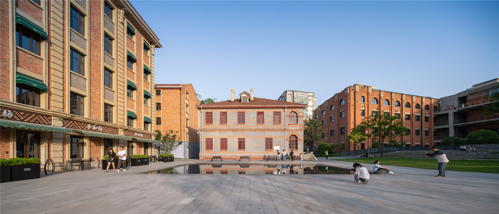
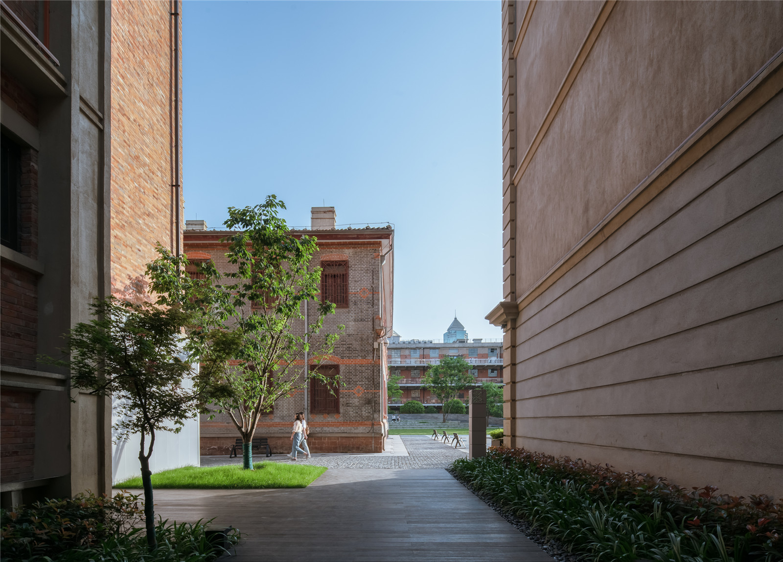
整合后的室外空间,既有开放的广场、也有狭窄的巷道,形成密度不一疏密有致的空间。
开敞的广场,使用尺寸规格大的花岗岩铺装;巷道空间则采用100*100mm的小料石铺装;平和打包厂的中庭,则采用100*50的细长条花岗岩铺装;不同规格的铺装,呼应了不同的空间密度。
The integrated outdoor space consists of both open squares and narrow alleyways, creating Spaces of varying densities. The open square is paved with large size granite; Roadway space is 100*100mm small stone pavement; The atrium of Pinghe Packing Plant is paved with 100*50mm slender granite; The different specifications of pavements echo different spatial densities.
▼呼应不同空间密度的铺装
Corresponding to the paving of different spatial densities ©赵奕龙
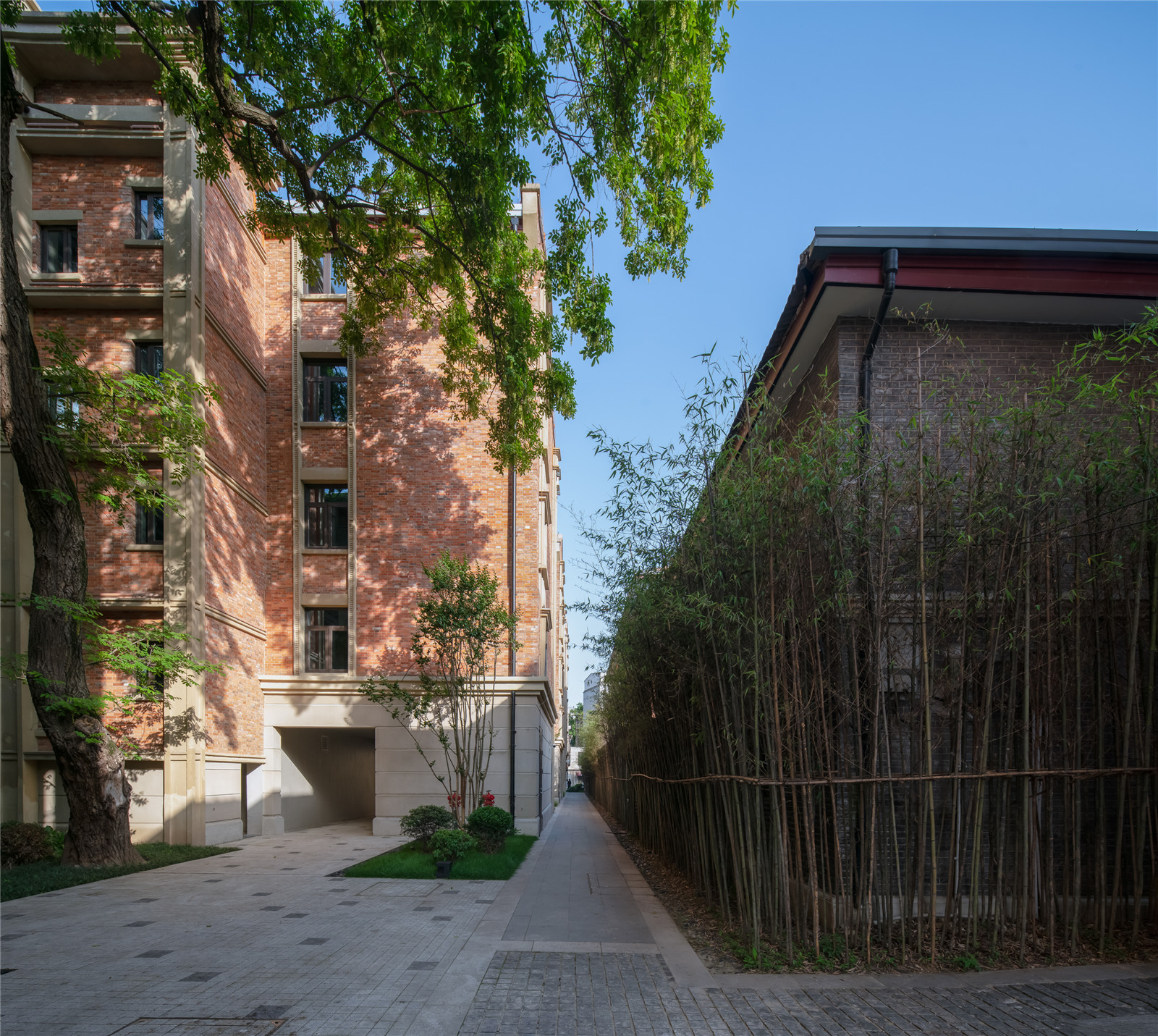
▼由巷子里看出去
Looking outside from the alley ©赵奕龙
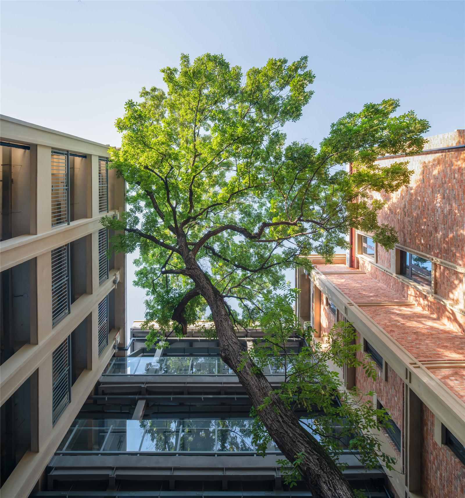
▼由街巷仰视天空
Looking up to the sky from the patio ©赵奕龙
适度
Moderation
“适度设计”这四个字的对立面就是“过度设计”;近几年,国内的景观设计充满着“过度设计”,尤其地产的售楼部景观设计:充满着堆砌元素和过度解读文化,拼贴着网红材料和过度追求精致,比如中式挑檐、干挂石材景墙营造的重重景观遮挡,美其名曰“步移景移”;这些景观项目最大的诟病一在于存在时间极短,楼一卖完即拆,浪费极大;二是“千城一面”,大部分售楼部景观宛如复制粘贴出来的,缺乏创新和思想内涵。而且在最后的照片呈现方式上,过度修片,创造一个不真实的幻像。
景观设计,比起建筑设计和室内设计,更需要追求适度的概念。景观设计师,始终要把自己放在跑龙套的位置上,做好配角。那么,适度设计的判断标准是什么?UAO主持建筑师李涛认为适度设计应该是遵循和分析场地的各种限制条件,得出恰当的解决方案的逻辑推理,同时在逻辑之上艺术化处理的一个过程(program)。
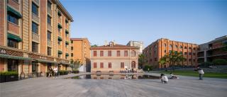
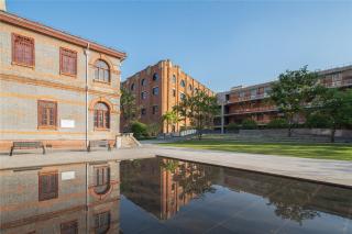
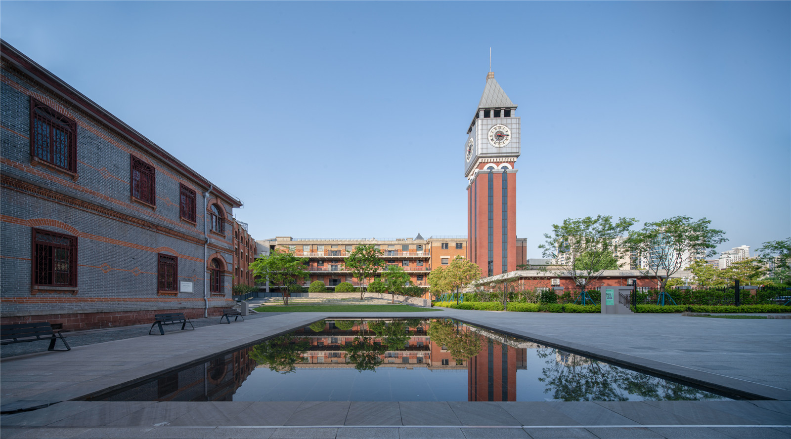
中轴线处于长江隧道上方,首先按建筑的规模来看,鲁兹故居这个建筑体量不大,并不能承担其轴线建筑的重任;但从城市区位来看,它处于两侧建筑的长边围合之下,透视纵深感强烈。为了让鲁兹故居担当起轴线建筑的重任,设计了一个仪式感的浅水面来强化仪式感。当举办活动时,水可以放干,又成为广场的一部分。
The opposite of “design in moderation” is “overdesign”. In recent years, the domestic landscape design is full of “overdesign”, especially the landscape design of the sales department of real estate: full of stacking elements and over-interpretation of culture, collage of web celebrity materials and excessive pursuit of exquisite, such as the Chinese cornice, dry-hung stone feature wall to create layers of landscape block, and even call it by a good name of ‘trading the scenery with moving steps’. The biggest criticism of these landscape projects is that the existence time is very short, and the building is dismantled as soon as it is sold, which is a great waste. The second is ‘same imagines of the city’, most of the sales department’s landscape is like a copy and paste, lack of innovation and ideological connotation. And finally in the way of photo presentation, they over-retouched, creating an illusion of unreality.
Landscape design, compared with architectural design and interior design, needs to pursue the concept of moderation. Landscape designers, always want to put themselves in the position of walk-on, do a good supporting role. So, what are the criteria for appropriate design? Li Tao, the chief architect of UAO, believes that appropriate design should be a process of logical reasoning based on following and analyzing various limitations of the site, arrive at the appropriate solutions. At the same time, artistic processing is carried out on the logic.
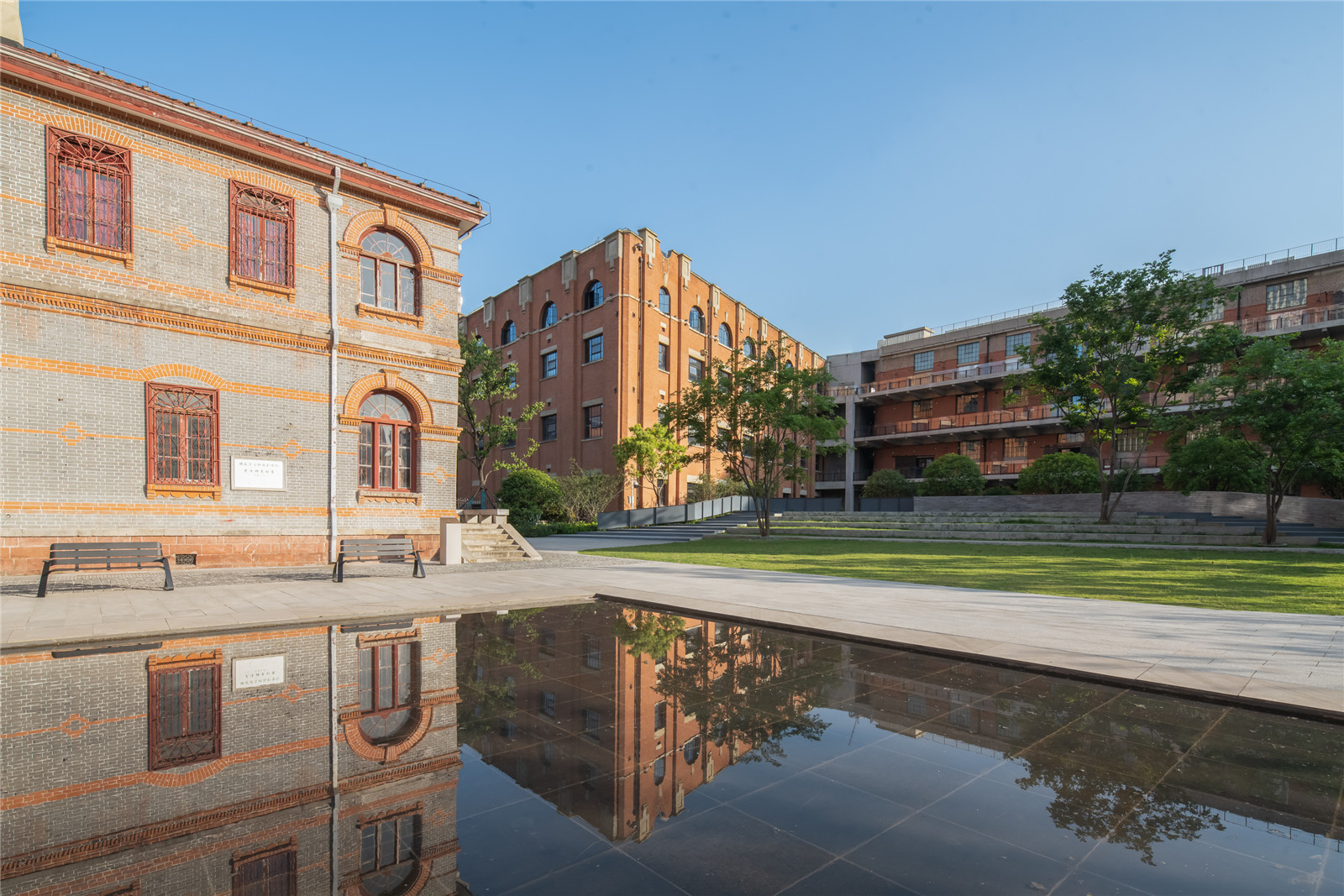
The central axis is above the Yangtze River Tunnel. First of all, according to the size of the building, Lutz’s former residence is not big enough to bear the heavy responsibility of being axis building. However, from the perspective of urban location, it is enclosed by the long side of the buildings on both sides, with a strong sense of perspective and depth. In order for Lutz House to assume the responsibility of the axis building, a ceremonial shallow water surface was designed to enhance the sense of ritual. When an event is held, the water can be drained and become part of the square again.
▼强化仪式感的浅水面
A ceremonial shallow water surface was designed to enhance the sense of ritual ©赵奕龙
▼水面近景
Closer look of the shallow water surface ©赵奕龙
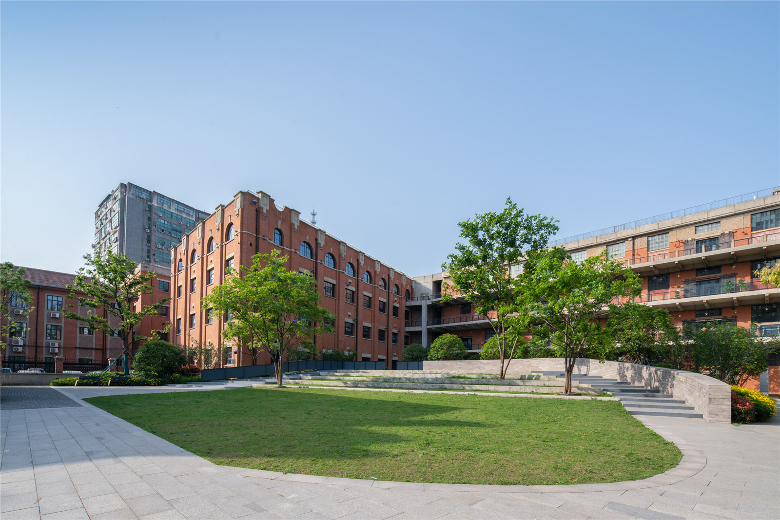
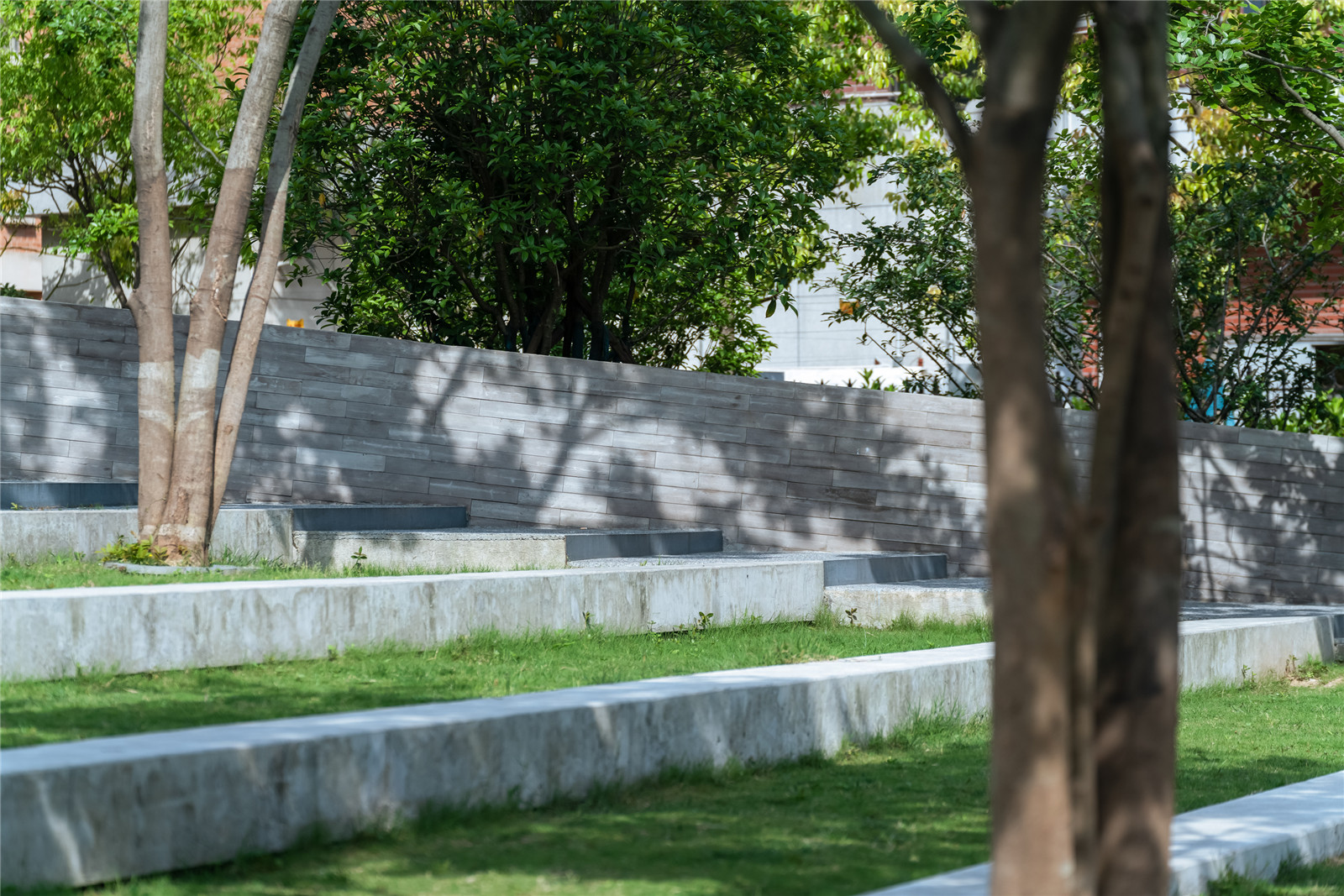
其次,“隧道上方”也成为限制设计的一个最重要的因素:不能种大树,不能做永久建筑物;我们严格按隧道的影响线,来分别处理场地的布置。影响线两侧种植高大乔木,南侧设计了台阶式草地和柿子树,挡住平和打包厂后区的停车场;南侧广场配置银杏和弹石铺装。
Secondly, “above the tunnel” has also become the most important factor limiting the design: no big trees can be planted, no permanent buildings can be built; We deal with the layout of the site strictly according to the influence line of the tunnel. Tall trees are planted on both sides of the line, and terraced grass and persimmon trees are designed on the south side to block the parking lot at the back of Pinghe Packaging Plant; The south square is equipped with ginkgo biloba and marble pavements.
▼南侧的台阶式草地与柿子树
The south square is equipped with terraced grass and persimmon trees ©赵奕龙
▼阶梯式绿地细部
Detail of the terraced grass ©赵奕龙
▼北侧的银杏与弹石铺装
Ginkgo biloba and slingstone pavements on the north ©赵奕龙
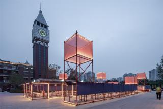
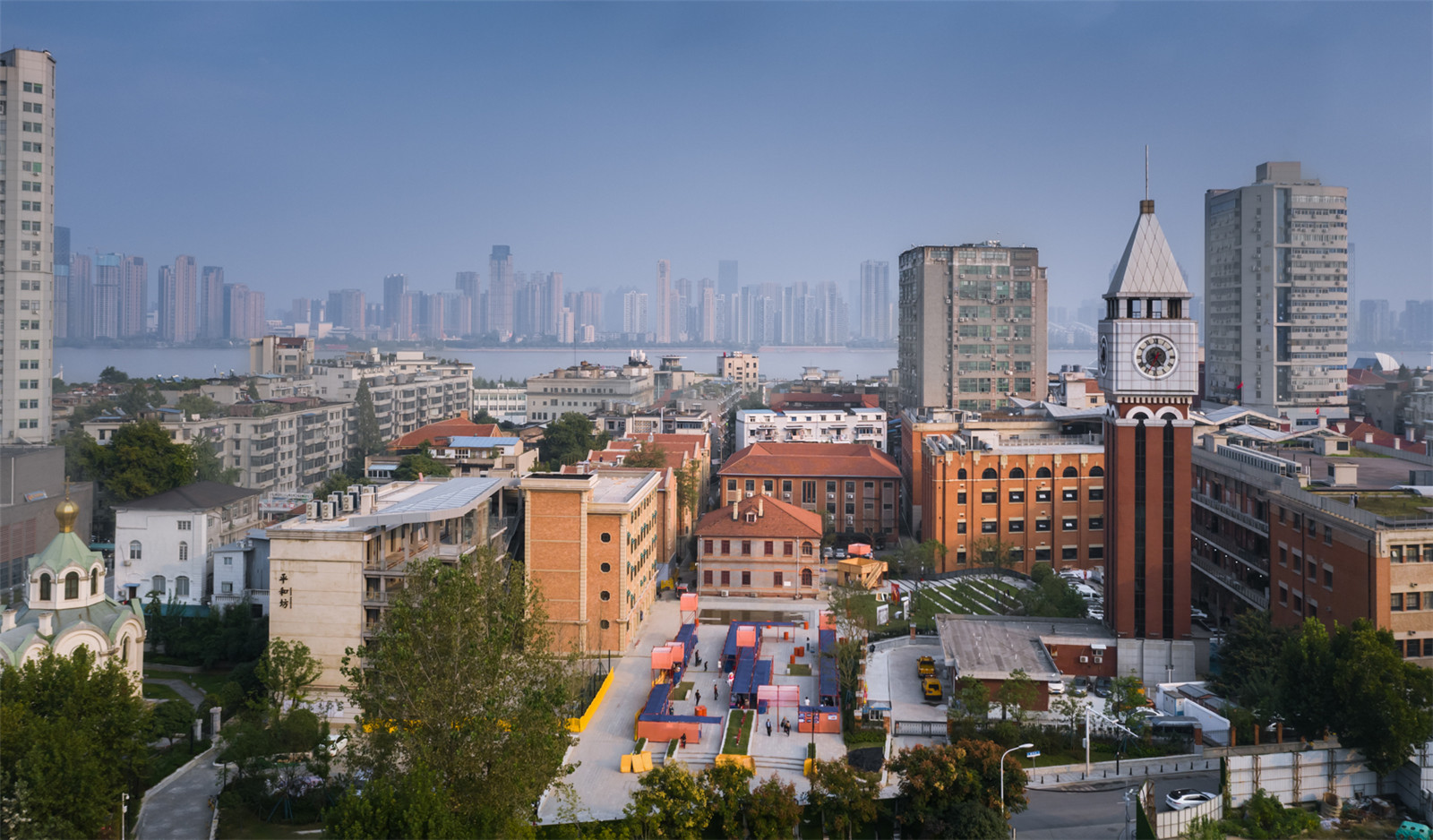
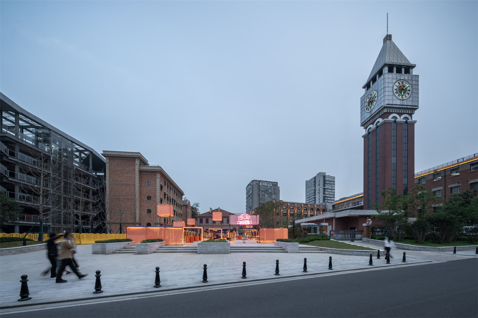
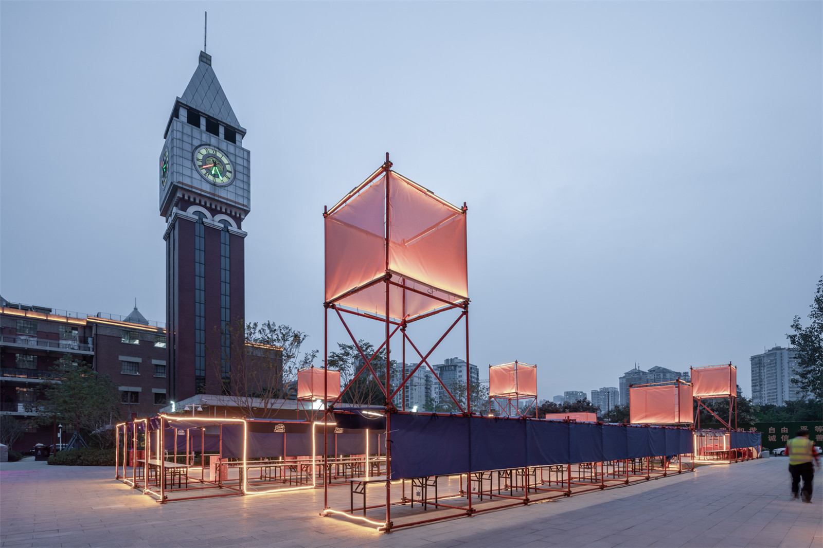
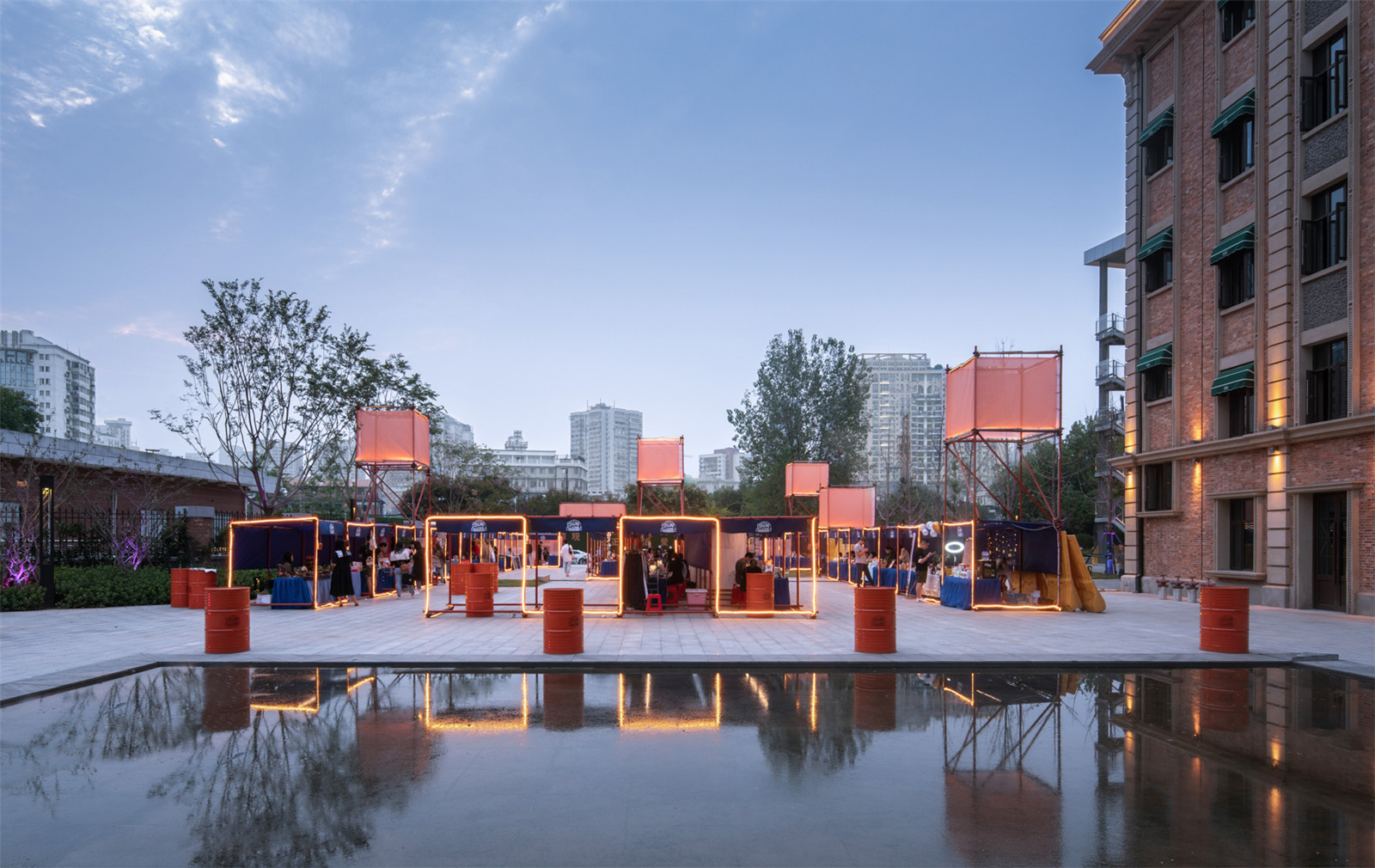
虽然为了响应隧道上方不建永久构筑物,平和坊中轴广场显的“空”,但它为后期举办各种活动带来了方便:2020年疫情后、UAO就在广场上设计了一个公益性的临时市集:“游乐敞2020”,市集用脚手架制作、按标准单元2*2*2组合,利用灯光和网格布的透明度形成漂浮在空中的“孔明灯”的形象。
In response to the fact that no permanent structures will be built above the tunnel, the central axis square of Pinghe Square is relatively empty, but it brings convenience for holding various activities in the later stage. After the epidemic in 2020, UAO designed a temporary public welfare market on the square: ‘Amusement 2020’ the market made of scaffolding, according to the standard unit combination of 2*2*2, using light and the transparency of the mesh cloth to form the image of “Kongming Lantern” floating in the sky.
▼公益性的临时市集:“游乐敞2020”
Temporary public welfare market on the square: ‘Amusement 2020’ ©赵奕龙
▼集市街景
Street view of the market ©贾然
▼脚手架与漂浮在空中的“孔明灯”
The scaffolding and the “Kongming Lantern” floating in the sky ©贾然
在景观大阶梯草坪边,用脚手架和欧松板,搭建了一个两层的“街头美术馆”。
A two-storey “street art gallery” is built on the side of the landscaped lawn with scaffolding and aussom boards.
▼街头美术馆航拍
The scaffolding and the “Kongming Lantern” floating in the sky ©贾然
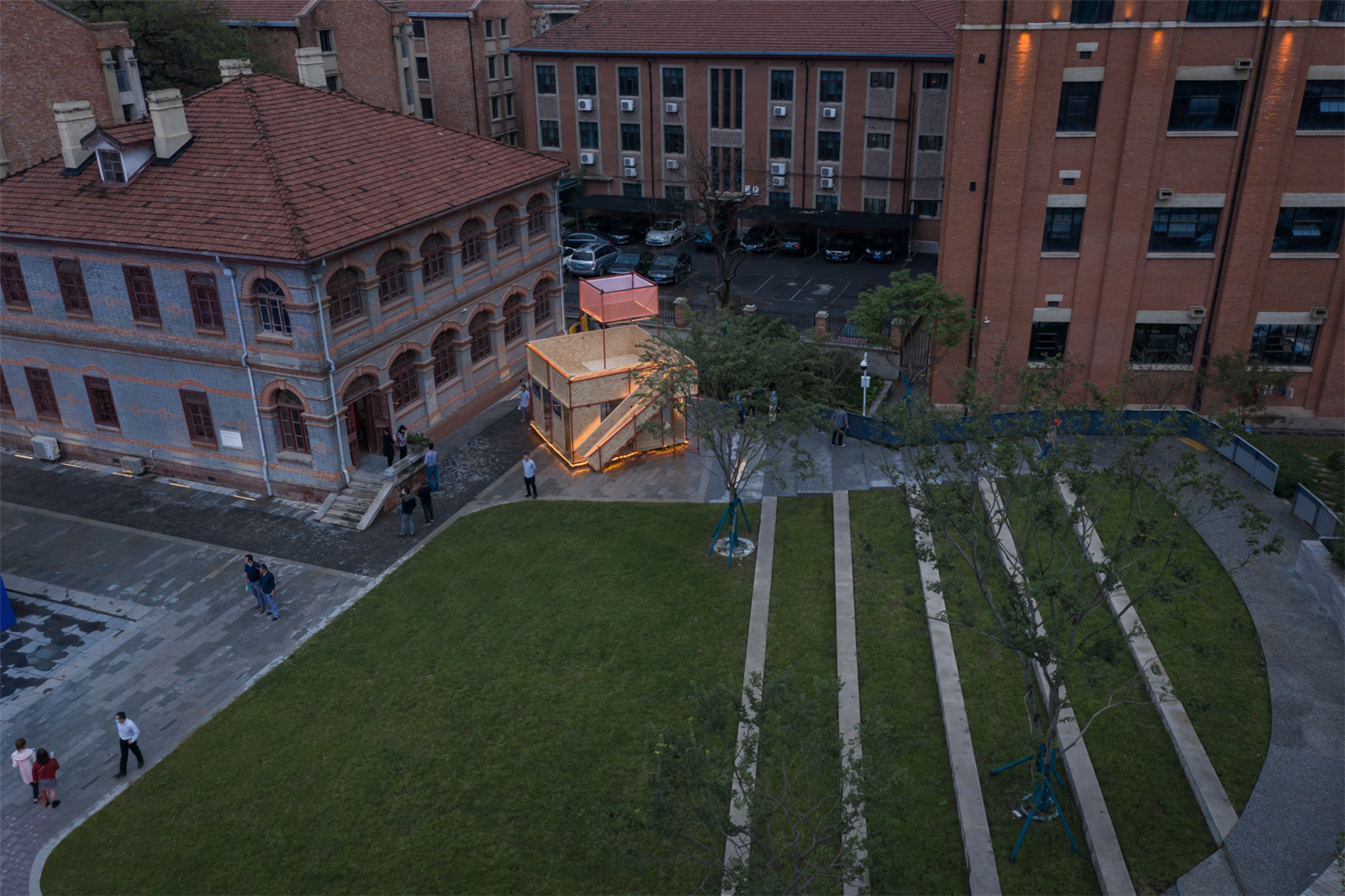
在周边三大百年以上的古建筑围合的广场上,UAO用现代的构件和古典的建筑对比并置,增加场地的吸引力,从而达到更加开放和多功能复合使用的公共性。UAO也希望利用自己的力量做些公益设计,助力武汉,回报社会。
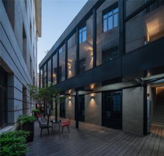
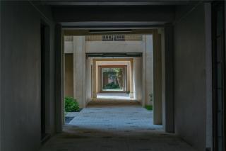
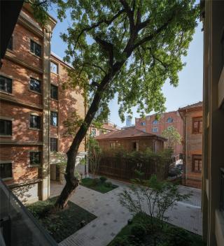
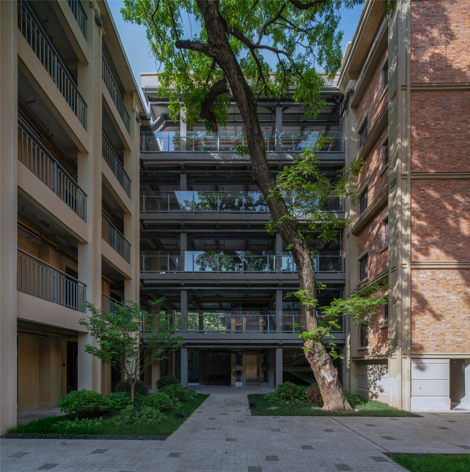
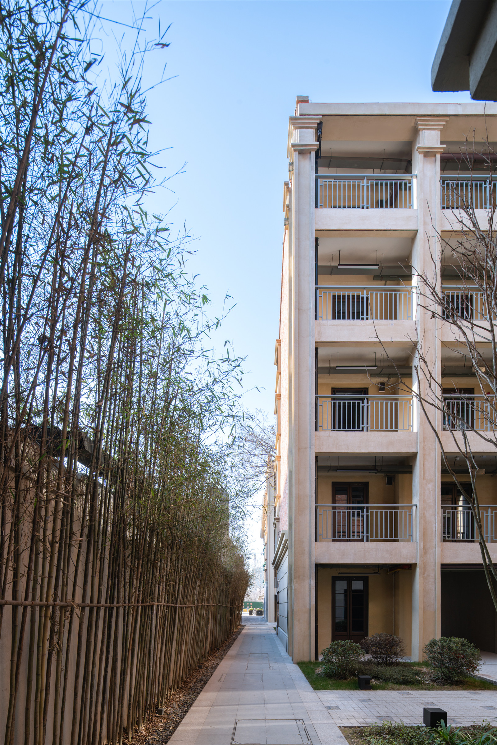
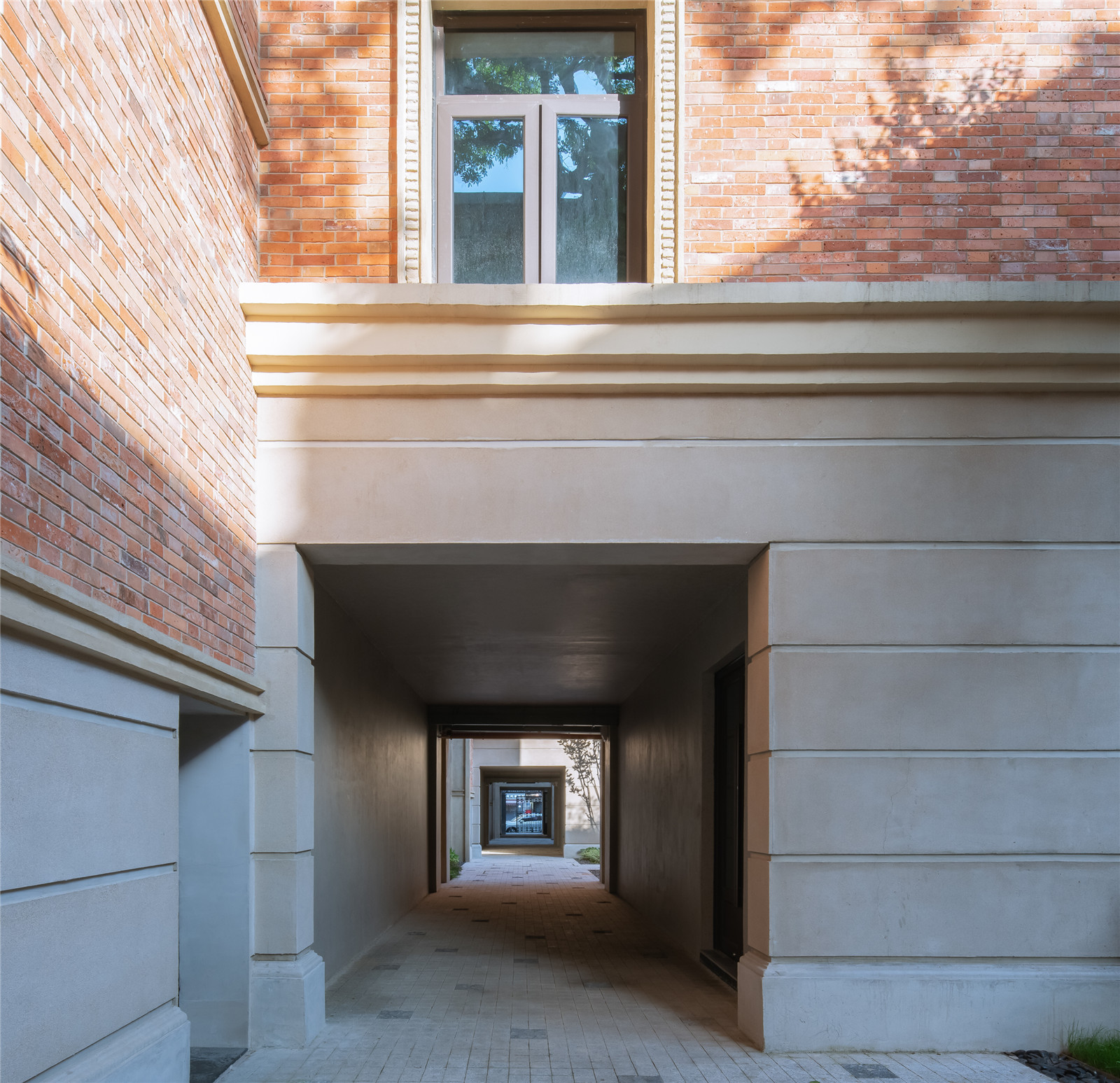
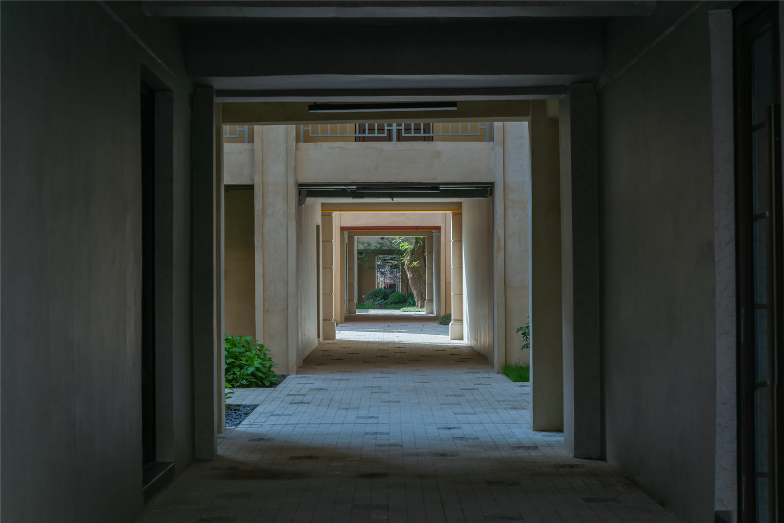
穿越周边的巷子,则用竹子遮盖住围墙,每个小院落里保留了原有的树木,但利用门洞嵌套的透视魅力,把几个院落串联起来。
In the square surrounded by three century-old buildings, UAO uses modern components and classical buildings to contrast and juxtaposition, increasing the attraction of the site, so as to achieve more open and multifunctional public use. UAO also hopes to make use of its strength to do some public welfare design to help Wuhan and give back to society.
In the surrounding alleys, bamboo is used to cover the walls. The original trees are kept in each small courtyard, but several courtyards are connected in series by the method of nested doorways.
▼保留原有树木的小院落
The small courtyard with the original trees ©赵奕龙

▼竹子遮盖住围墙
Bamboo is used to cover the walls ©赵奕龙
▼门洞嵌套的透视魅力
Several courtyards are connected in series by the method of nested doorways ©赵奕龙
并置
Juxtaposition
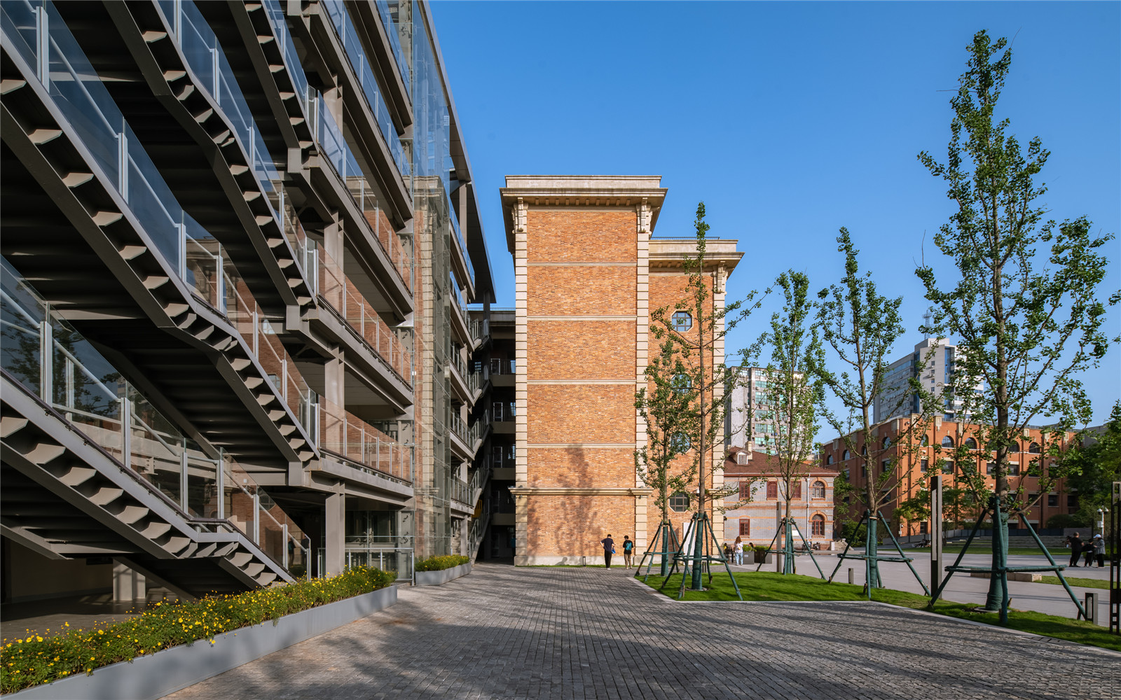
历史街区的景观和室内改造,并不是因循守旧的过程,反而应该植入新的元素,体现当代感。这些新植入的部分,运用钢结构、玻璃等当代的材料,与旧建筑的红砖、水泥形成对比;将新与旧并置在一个空间里。
The landscape and interior renovation of the historic district is not a process of sticking to the old ways. Instead, new elements should be implanted to reflect the contemporary sense. These newly inserted parts, using contemporary materials such as steel structure and glass, contrast with the red brick and cement of the old building. The juxtaposition of the old and the new in one space.
▼场地边角位置的钢结构建筑
The steel structure building at the corner of the site ©赵奕龙
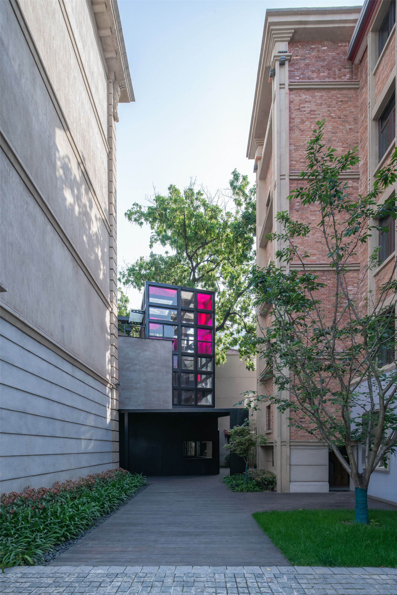
▼新与旧并置在一个空间里
The juxtaposition of the old and the new in one space ©赵奕龙
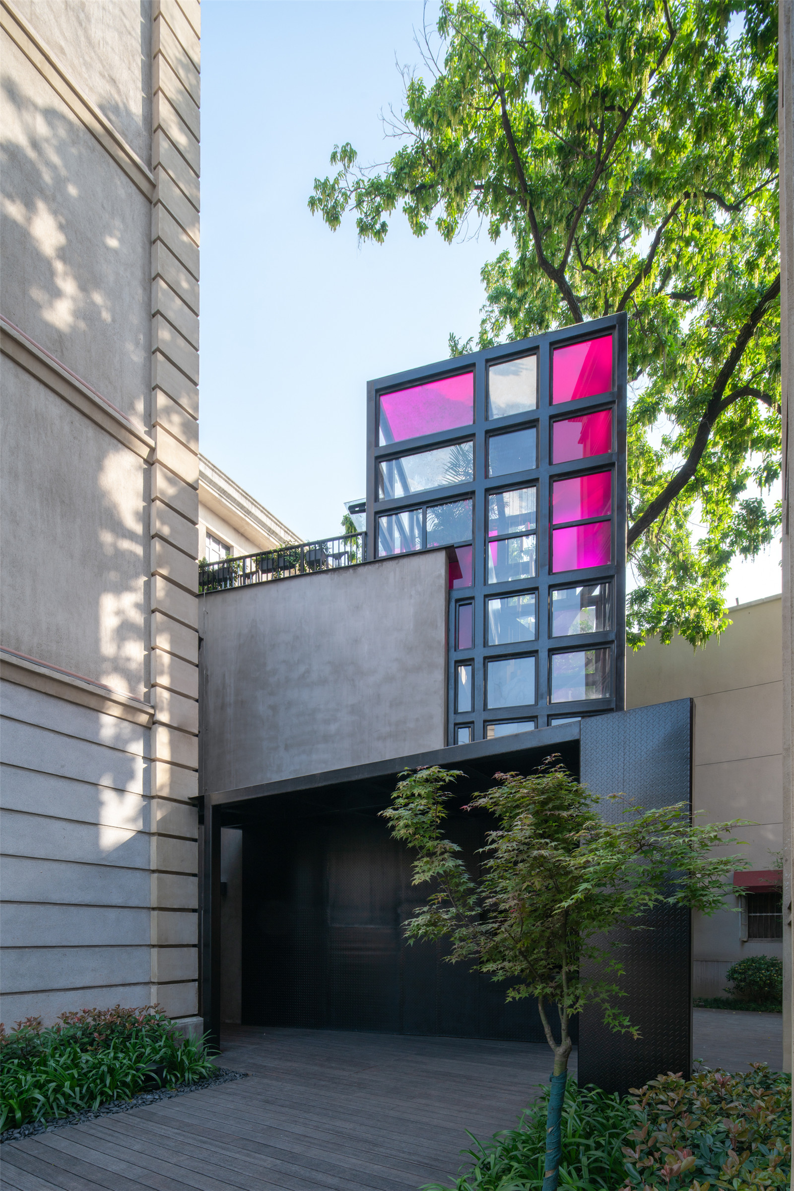
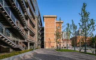
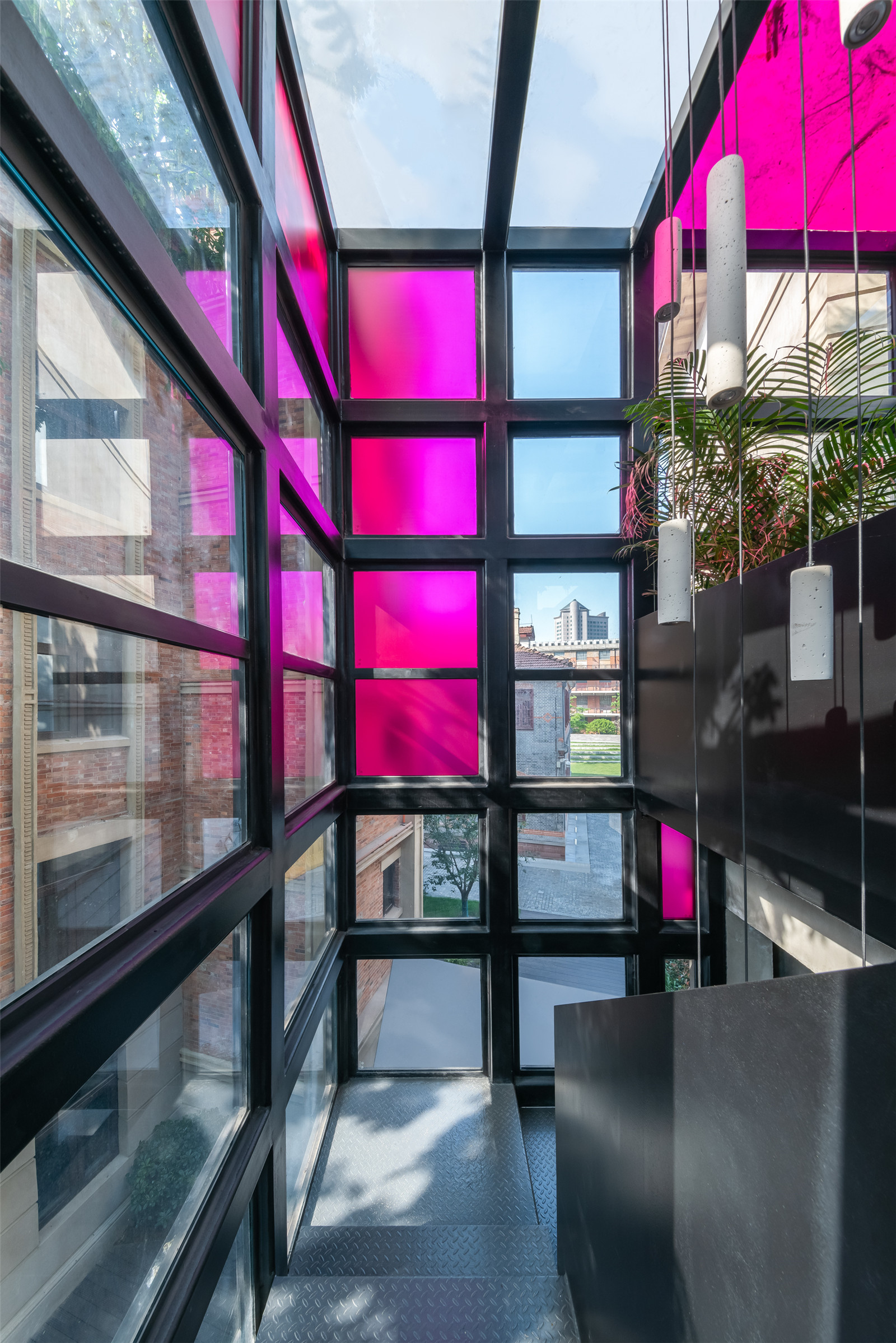
在场地边角的位置,原有的小楼增加了新的疏散楼梯,UAO通过外包钢结构和彩色玻璃,将本来一个消极的空间,变成院落空间的端景。并置尤其体现在室内公共空间的设计上。
At the corner of the site, a new evacuation staircase was added to the original small building. UAO transformed a negative space into the scenery of the courtyard space through the outer steel structure and stained glass.The juxtaposition is especially reflected in the design of indoor public space.
▼外包钢结构和彩色玻璃的疏散楼梯
Evacuation staircase with outer steel structure and stained glass ©赵奕龙
平和打包厂作为百年历史建筑,在改造过程中建筑设计单位按新的规范增加了楼梯和电梯间;
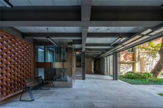
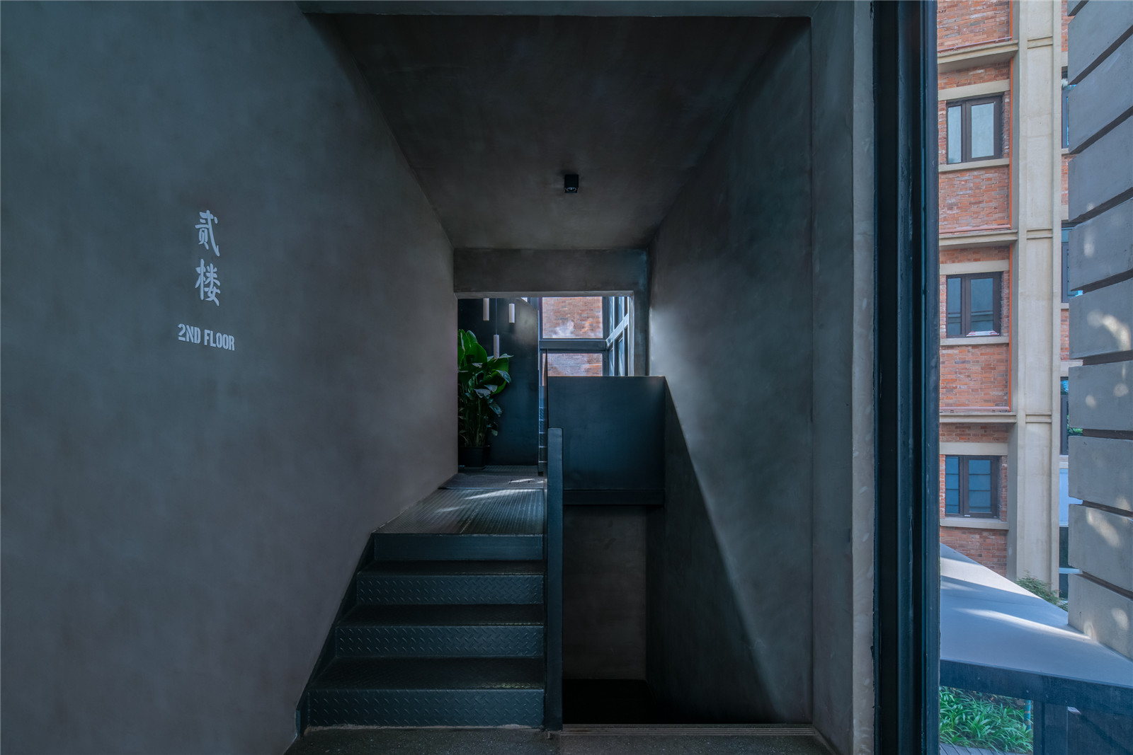
UAO针对新增的公共电梯间等位置,用黑色钢板为主要设计元素:钢板材料具有可逆性,尤其是和历史建筑的砖墙材料进行强烈的对比;钢板被运用在楼梯栏杆和栏板、电梯间主题墙面、卫生间隔板造型以及屋顶花园等部分。钢板结合楼栋分区的大尺度英文大写字母灯箱,形成具有非常当代性的表达。
As a century-old building, the Pinghe Packing Plant has been renovated with the addition of stairs and elevators in accordance with the new regulations.
UAO uses black steel as the main design element for the new public elevator. The steel material is reversible and contrasts strongly with the brick wall material of the historic building. Steel plates are used in the railing of stairs, the themed walls of elevator rooms, the moulding of bathroom partitions and the roof garden. The steel plate combined with the large scale English capital letter light box of the building partition forms a very contemporary expression.
▼黑色钢板为主要设计元素
Black steel as the main design element for the new public elevator ©赵奕龙
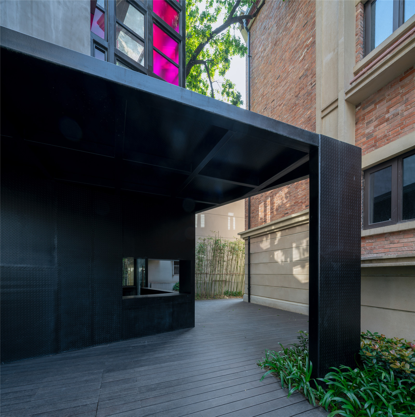
▼黑色钢板和历史建筑的砖墙材料产生强烈的对比
The black steel plate provides a strong contrast to the brickwork of the historic building ©赵奕龙
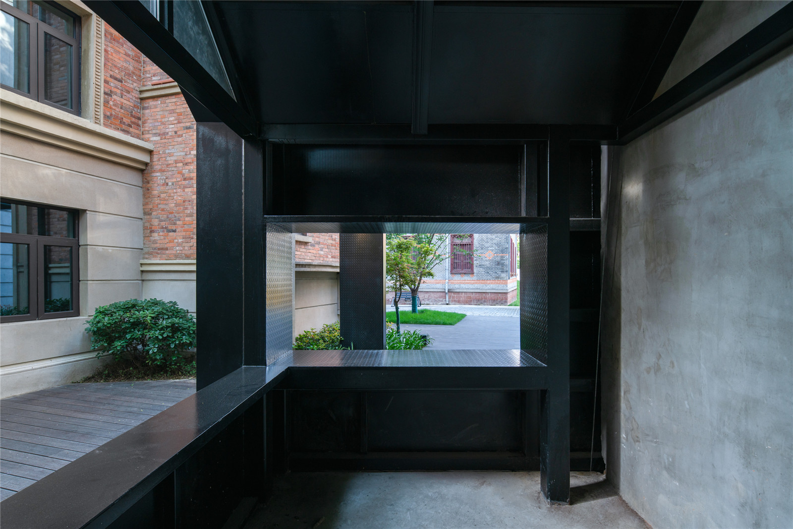
▼钢结构与玻璃的运用
Application of Steel Structure and Glass ©赵奕龙

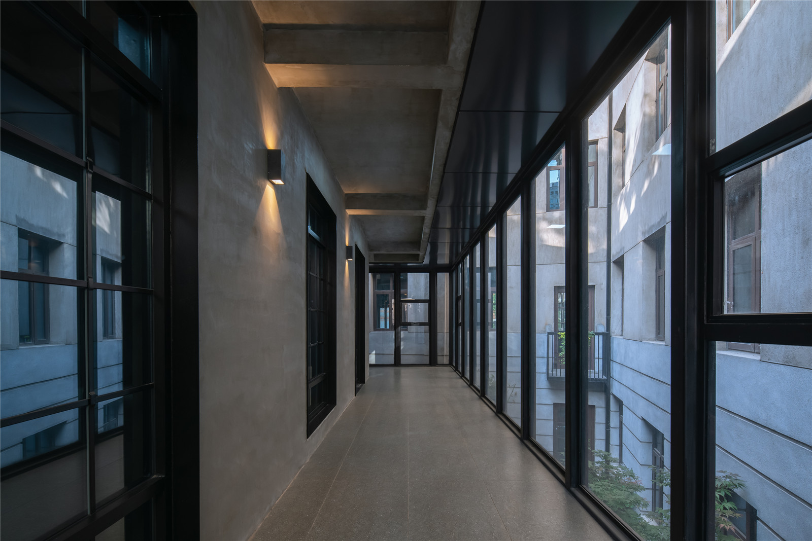
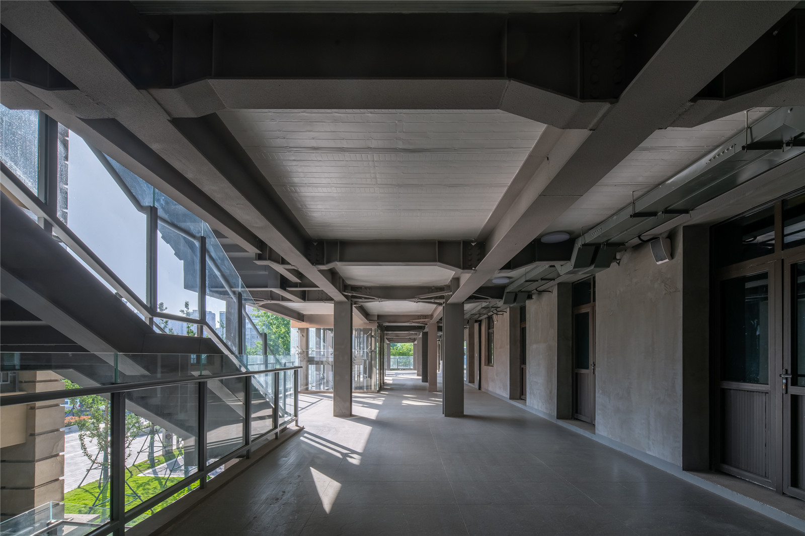
分区主题彩色涂料的应用,标示出各个楼栋的主题色,便于访客快速到达指定楼栋和楼层。其他非重点公共部分,设计只变成“导则”存在,只对场地进行简单的整理,增加安全设施和照明设施,只为彰显建筑的原有风格和空间特色。
The application of zonal theme color paint marks the theme color of each building, so that visitors can quickly reach the designated building and floor. For other non-key public parts, the design only becomes “guidelines”. The site is simply arranged. Security facilities and lighting facilities are added to highlight the original style and spatial characteristics of the building.
▼走廊
Hallway ©赵奕龙
▼楼梯
Staircase ©赵奕龙
结语
Epilogue
平和坊的景观和室内公区设计,既遵循将各区域建筑空间织补在一起的原则,也遵循新的设计与老建筑保留一定距离的原则。这不仅是物理距离,更多的是设计的年代距离、材料质感距离和空间尺度距离。尤其在空间上,在每一个尺度空间上,都将各个年代的材质集中地进行了展示和对比:红砖、花岗岩、自流平、钢板等;保留原有空间的老的味道,并展现老空间的韵味,将他们并置,又织补在一起,是本次改造设计的重点和核心。
The design of landscape and interior public area of Pinghe Square not only follows the principle of weaving the architectural space of each area together, but also follows the principle of keeping a certain distance between the new design and the old building. This is not only the physical distance, more is the age distance of design, distance of the material texture and distance of the space scale. Especially in every scale of space, the materials of each age are displayed and compared: red brick, granite, self-leveling, steel plate, etc. To keep the old flavor of the original space and show the charm of the old space, to juxtapose them and knit them together is the focus and core of the renovation design.
▼可以休憩的新空间
New space for rest ©赵奕龙
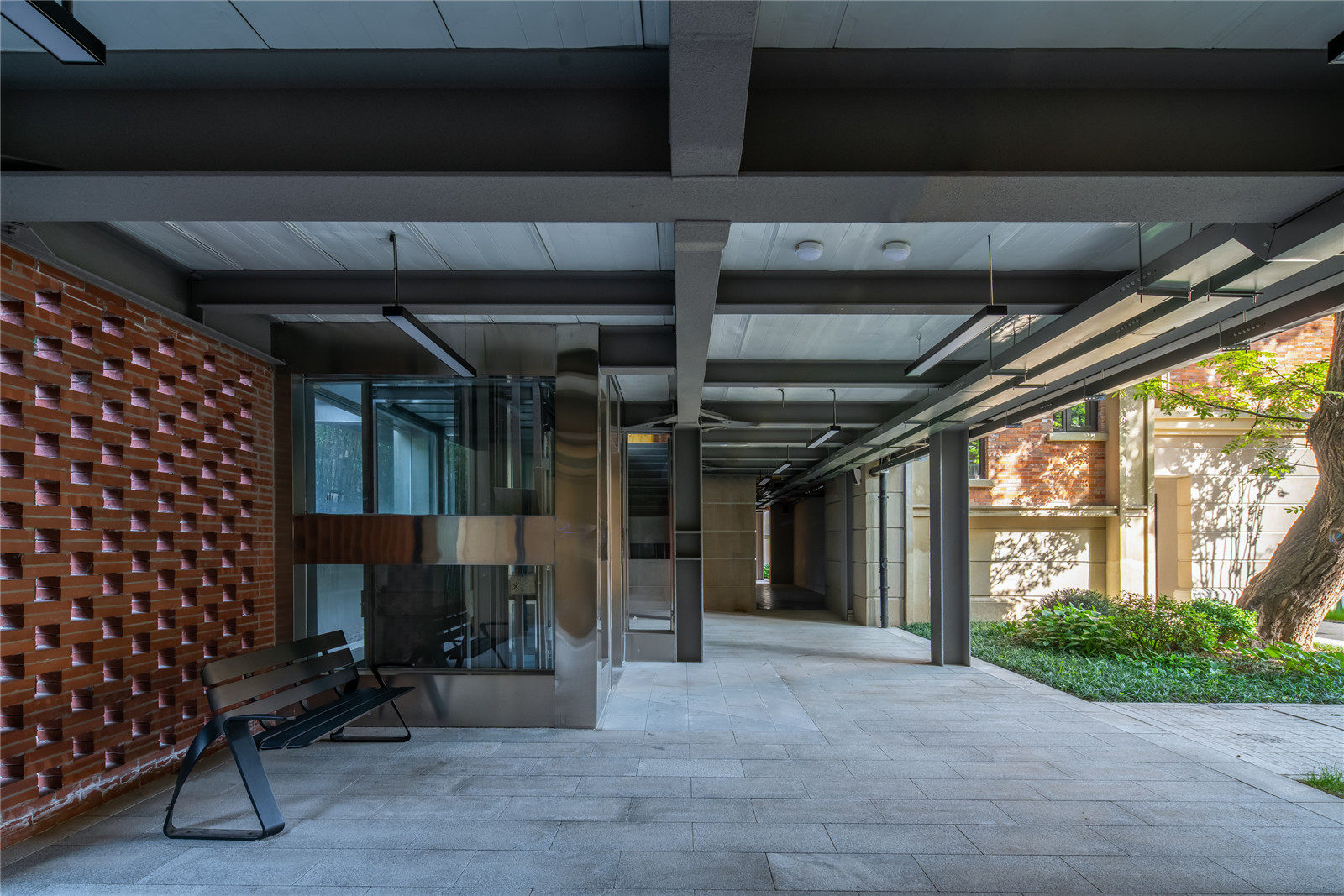
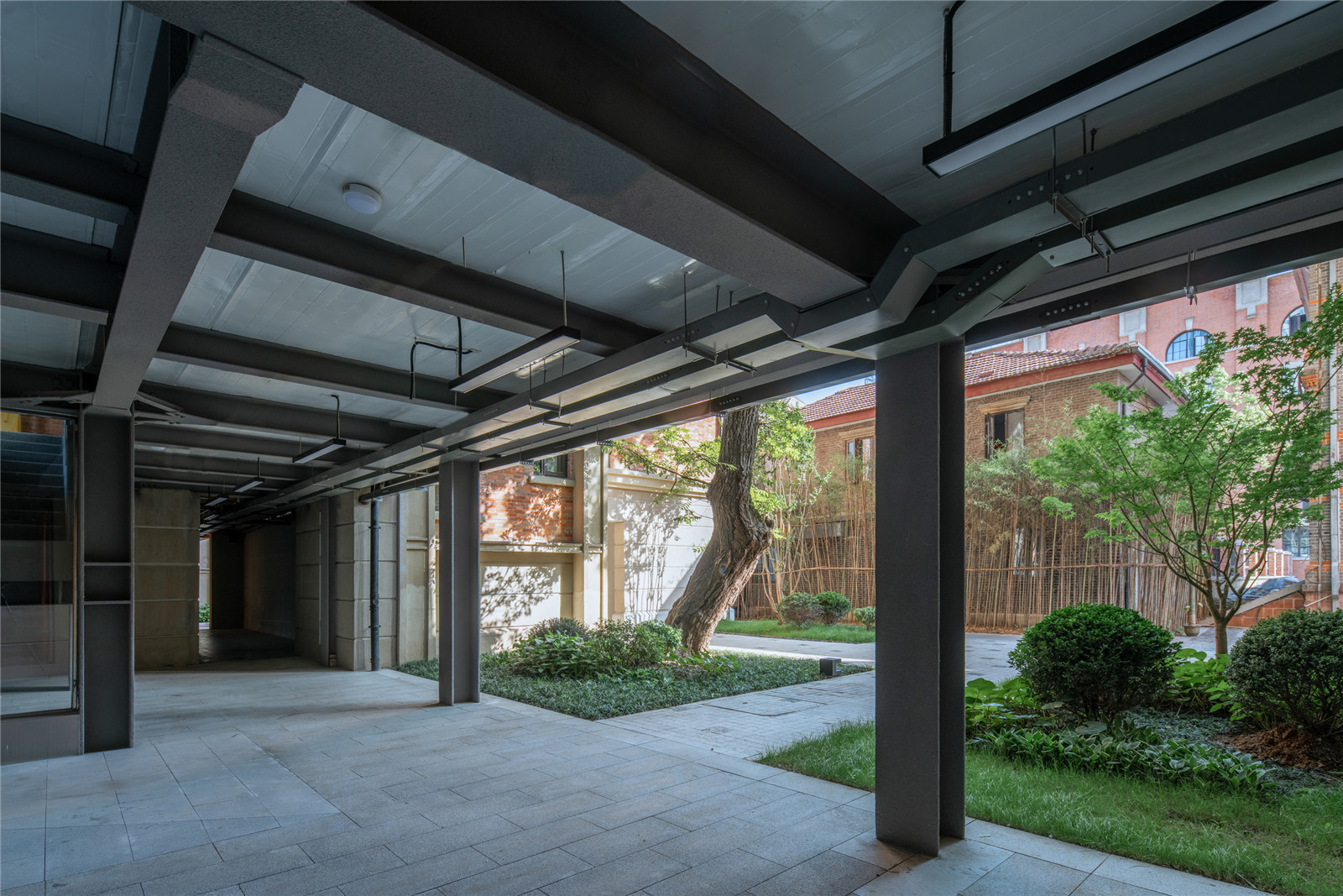
▼改造后的和平打包场室内公区
The indoor public area of thePinghe Packing Plant after the renovation ©赵奕龙
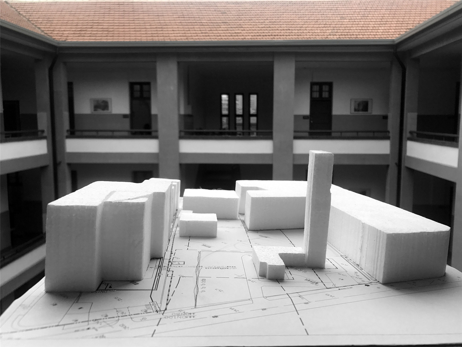
▼最初方案模型
The initial project model ©UAO瑞拓设计
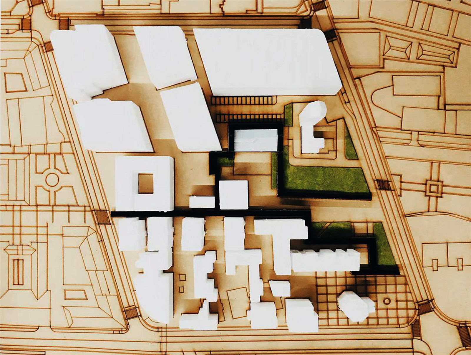
▼场地模型
Site model ©UAO瑞拓设计
▼总平面图
Master plan ©UAO瑞拓设计
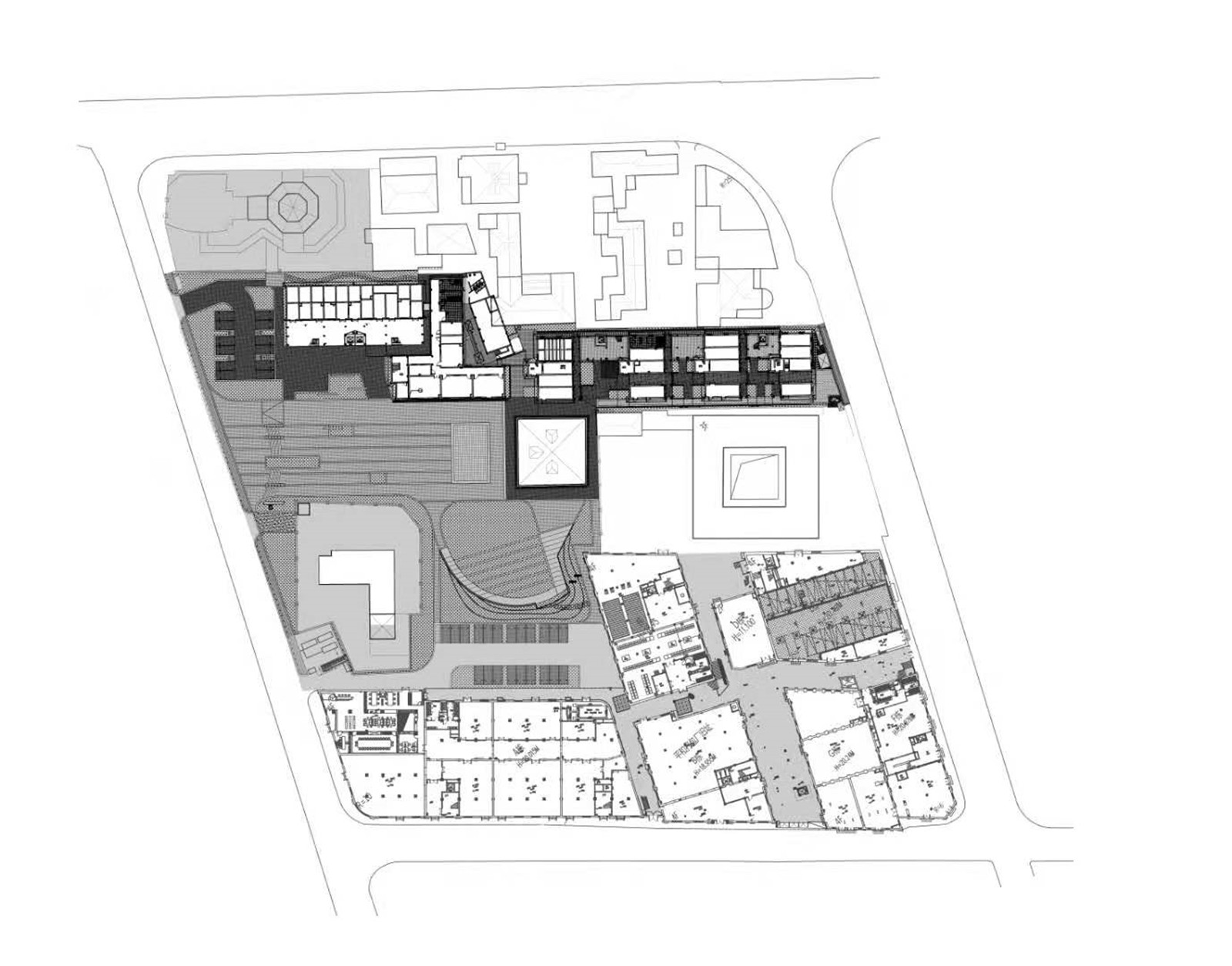
▼景观总平面图
Landscape master plan ©UAO瑞拓设计
▼立面图Elevation
©UAO瑞拓设计

项目名称:平和坊百年历史街区景观及室内公区设计
项目地点:武汉
设计公司:UAO瑞拓设计
图片来源:UAO瑞拓设计 / 赵奕龙 / 贾然
景观和室内公区改造设计团队:UAO瑞拓设计
主持设计师:李涛
团队成员:邹月勤、张杰铭、王纤惠、孔繁一、李莉霞、龙可成、胡炳盛、晏罗蒂、苏张希
建筑设计单位:中信建筑设计总院
中文:李涛
翻译:何岱恒
Landscape and interior Commons renovation design team: UAO Design
Host Designer: Li Tao
Team members: Zou Yueqin, Zhang Jieming, Wang Xianhui, Kong Fanyi, Li Lixia, Long Kecheng, Hu Bingsheng, Yan Luodi, Su Zhangxi
Architectural Design: CADI
Chinese: Li Tao
Translator: He Daiheng
版权声明:本文版权归原作者所有,请勿以江南电竞官网登录入口 编辑版本转载。如有侵犯您的权益请及时联系,我们将第一时间删除。
投稿邮箱:info@landscape.cn
项目咨询:18510568018(微信同号)
