旭辉嘉兴广场景观设计 | 荷于景观
-
项目名称:旭辉嘉兴广场
-
项目地点:浙江省嘉兴市老城区中山东路
-
项目规模:7300㎡
-
设计公司:
-
建成时间:2020年
-
图片来源:须然摄影、邬涛
在找寻答案时,与其讨论风格,还不如去探讨方法或者特定的觉醒。
—— < 彼得·卒姆托>
这是一个典型的城市更新商业改造项目,由于老城区的交通及生活界面的限制,空间及场地的内外割裂,使得这里渐渐失去它原本的生活氛围。大家都很迫切得希望能找到一个城市更新的切入点,而作为中山北路段旭辉广场的成功,无疑给老城区的改造带来了新的思路。
This is a typical urban renewal commercial transformation project. Due to the limitations of the traffic and living interface in the old city, the space and site are separated from the inside and outside, making this place gradually lose its original living atmosphere.Everyone is eager to find an entry point for urban renewal, and the success of CIFI Plaza in the north section of Zhongshan will undoubtedly bring new ideas to the renovation of the old city.
区位介绍
SITE INTRODUCTION
中国 ·浙江省 · 嘉兴市
初勘场地的时候,这边的商业人气非常冷清,很多店铺濒临倒闭,只有转角的几家餐饮店在用餐时间有一些消费者。诺大的商业综合体像是废弃很久的公寓前广场,难以想像这里是位于城市繁华的老城中心。
When the site was first surveyed, the commercial popularity here was very deserted, and many shops were on the verge of closing down. Only a few restaurants around the corner had some consumers during meal time. The commercial complex of connaught university is like a long-abandoned square in front of an apartment. It is hard to imagine that it is located in the center of the city.
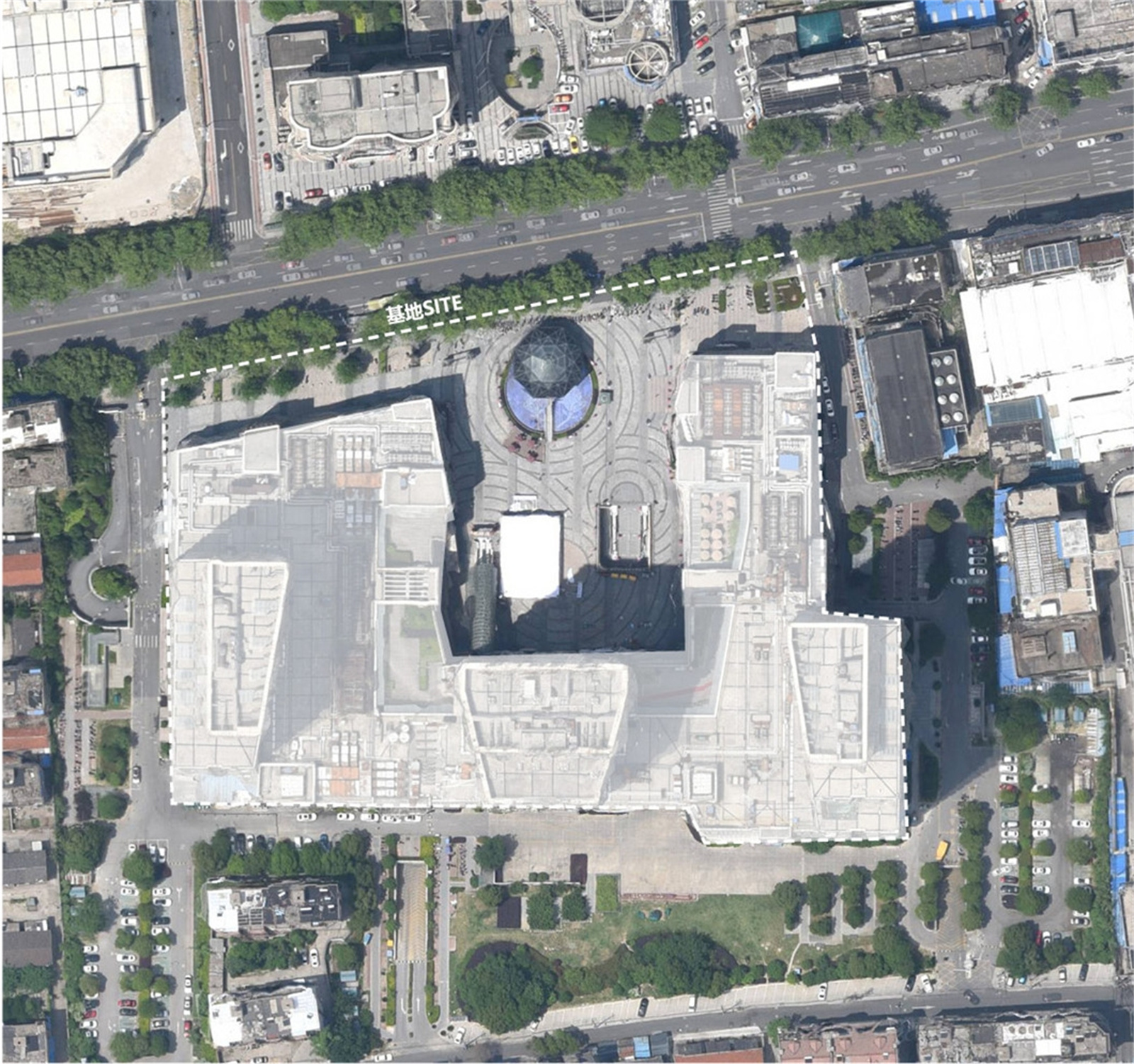
这里是城市情节最深的区域,更是城市发展的原点,作为商业的旧改项目,如何在成本有限的情况下,最大程度的重新激活商业,是巨大的挑战。
This is the area with the deepest urban plot, and it is also the origin of urban development.As an old commercial reform project, how to reactivate the business to the greatest extent with limited costs is a huge challenge.
基地现状
SITE INTRODUCTION
调研 · 痛点分析
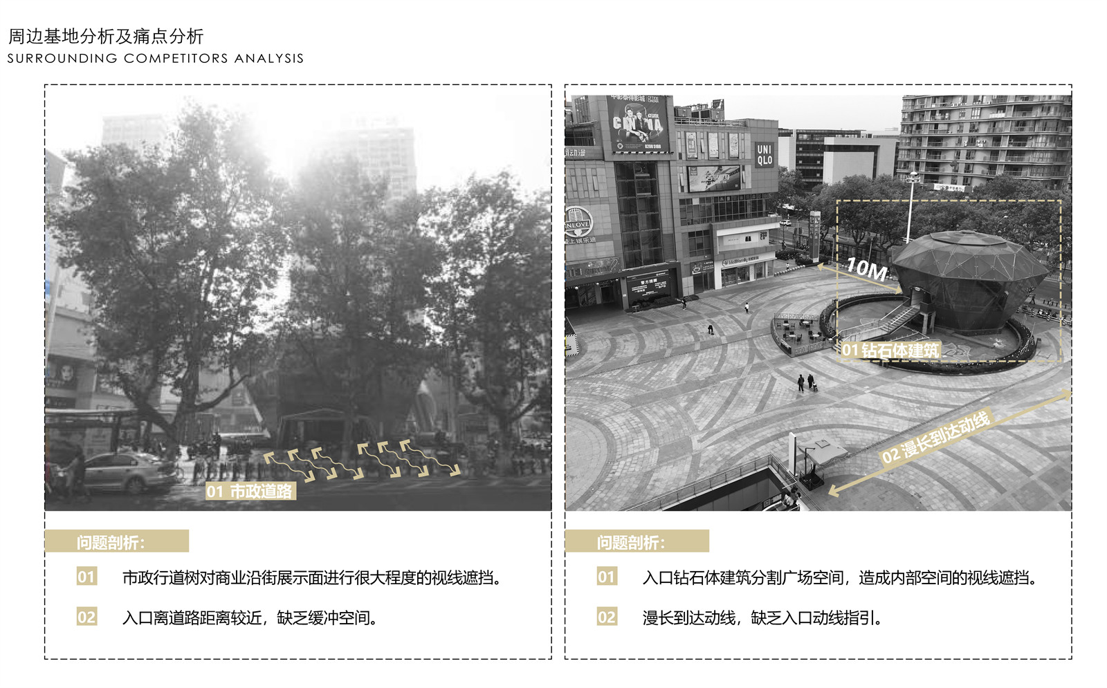
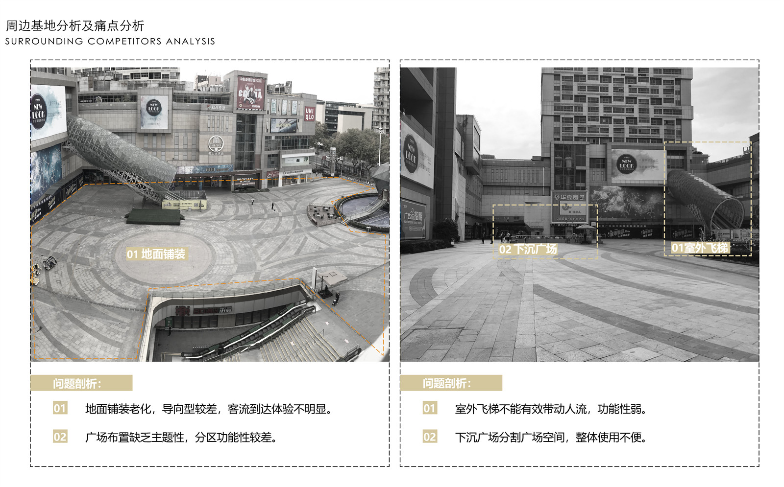
沿街展示面几乎被茂密的行道树遮挡,门口沿街摆放的杂乱无章的非机动车,完全看不到商业的立面,原本就是U字型的场地,在U字型的端头,设置了巨大的砖石玻璃体,笨重的造型,废旧老化的玻璃,让原本就不利的商业展示面更是雪上加霜。
Retail frontage is almost obscured by dense street trees. There are disorderly non-motorized vehicles placed along the street at the door, and the commercial facade is completely invisible. It was originally a U-shaped venue. At the end of the U-shaped, a huge The masonry glass body, the bulky shape, and the old and aging glass make the already unfavorable commercial display even worse.
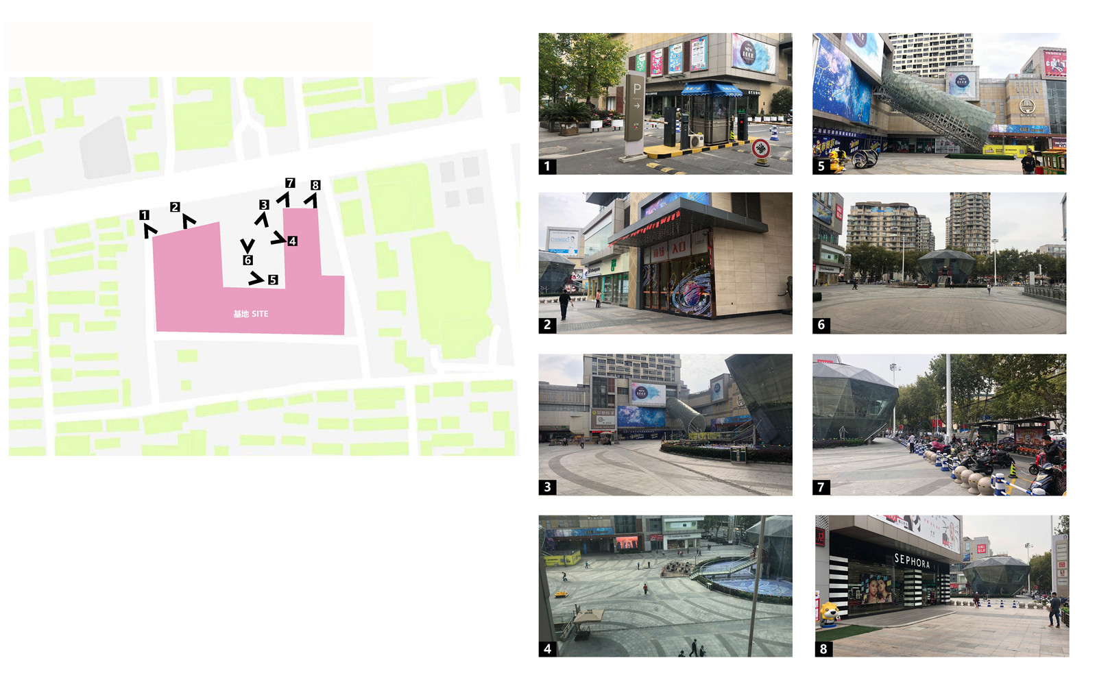
▼现状场地——沿街展示面
▼现状场地——商场入口
设计策略
DESIGN STRATEGY
项目定位 ·设计分析 · 改造策略
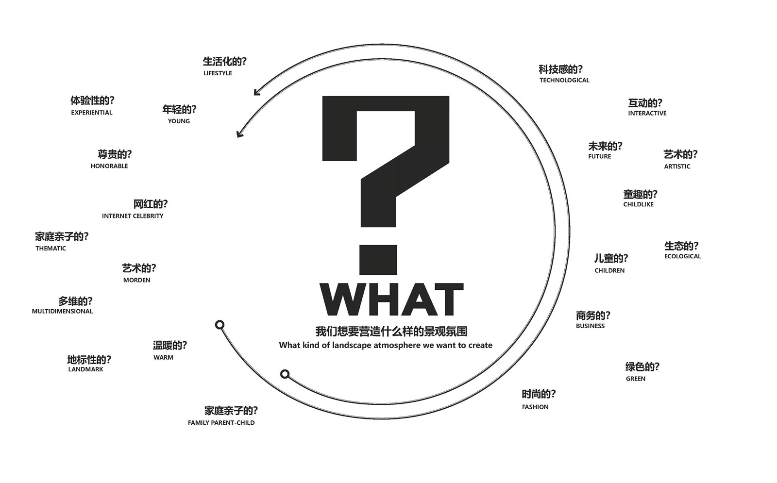
首先,商业的定位是我们要最先确立的方向,也做了几种假设,经过对场地客群,周边环境的反复调研,以亲子互动场所为主题的家庭亲子社区景观确立为我们的项目定调。
First of all, the orientation of business is the direction we want to establish first, and we have also made several assumptions. After repeated investigations on the site and the surrounding environment, the family parent-child community landscape with the theme of parent-child interaction is established as our tune.
▼设计定位
针对场地本身特质,我们做了尺度分析,视线分析,限制性条件分析,并根据场地的业态和进出口的流线,制定了预期改造的功能分区。
In view of the characteristics of the site itself, we have done scale analysis, line of sight analysis, and restrictive condition analysis, and based on the site's format and the flow lines of entrances and exits, we formulated the functional zoning of the expected transformation.
▼设计策略分析

▼改造策略


总图设计
DESIGN SPACE
重塑 ·激活 · 复兴
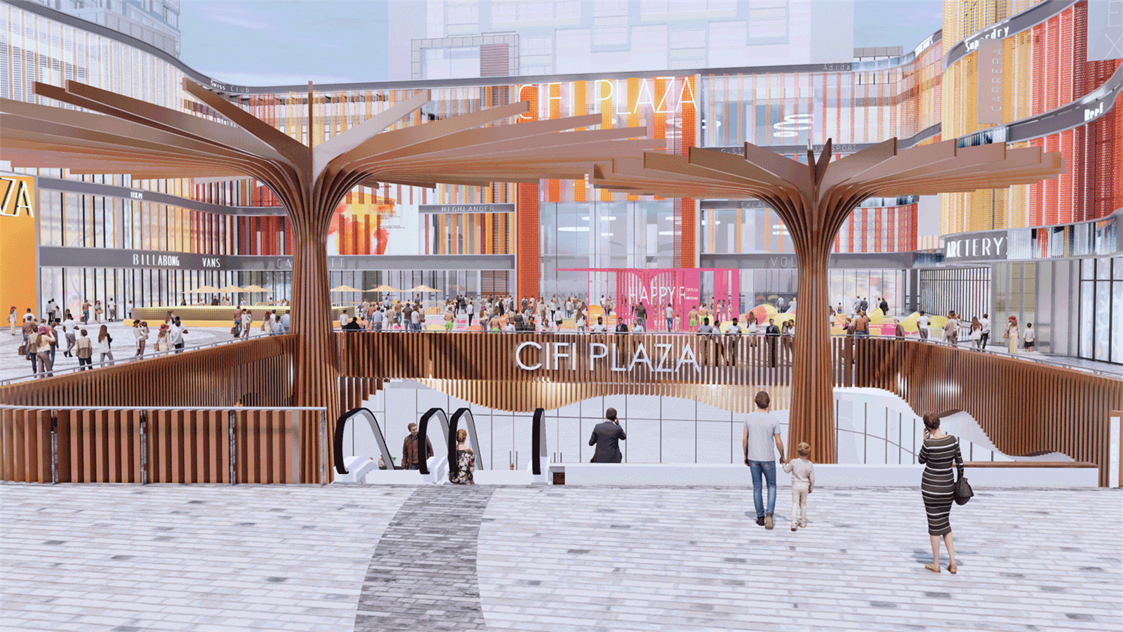
重塑,激活,复兴是我们贯穿整个景观改造工程的关键词。我们以景观为城市空间赋格的逻辑介入,从多角度对位呼应场地状况与城市空间的关系。将原本的U型场地打开,重塑,编织,融合,以全新的视角重新定义了深处老城区腹地的商业景观。
Remodeling, activating, rejuvenating are our key words throughout the landscape renovation project. We take the landscape as the logical intervention of urban space fugue, and echo the relationship between site conditions and urban space from multiple perspectives. The original U-shaped site is opened, remodeled, woven, and integrated to redefine the commercial landscape deep in the hinterland of the old city with a new perspective.
▼总体鸟瞰图
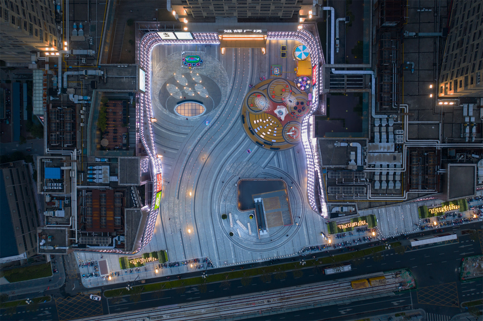
为了激活商业场所空间,我们提出了两个不同的层级,我们将整个场地的表面变成一个由明确线条构成的网络。第一个层级是线性的,它构成了具有场地特征的背景,其设计主要依附于既有的视觉通廊和景观轴线。另一个层级是有机且流动的,呼应了人群与商业之间自然的移动方式。
To activate the commercial space, we propose two different levels, we transformed the entire surface of the site into a network of clear lines. The first level is linear, it forms the context with site characteristics, and its design is mainly attached to the existing visual corridors and landscape axes. The other layer is organic and fluid, echoing the natural movement between people and businesses.


▼有机且流动的线条呼应了人群涌入商场自然而然的移动方式
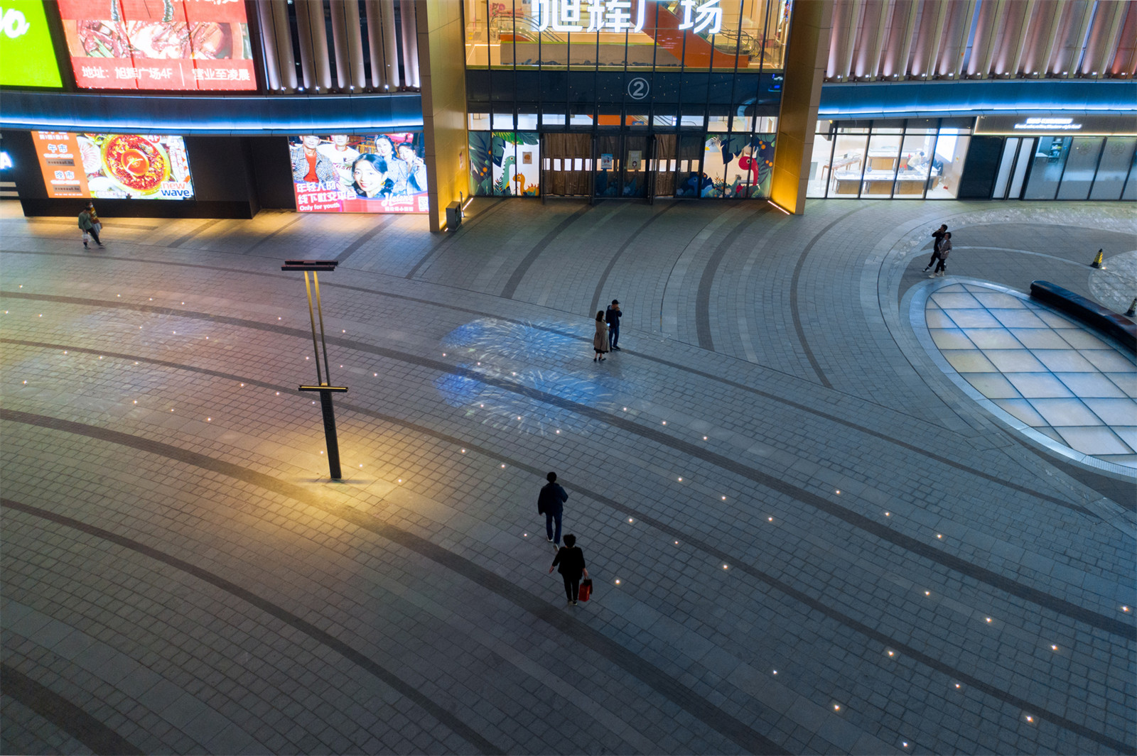
有机且流动的线条呼应了人群涌入商场自然而然的移动方式,这样的结构不仅塑造了路径,还自然地生成了一系列功能各异的主题空间:寓意梦幻峡谷的下沉广场,寓意森活集市的景观广场,寓意魔法树林的外摆休闲区,寓意绿野仙踪的儿童乐园。
The organic and flowing lines echo the natural movement of people pouring into the mall. Such a structure not only shapes the path, but also naturally generates a series of themed spaces with different functions: the sunken plaza, which means the dreamy canyon, and the living collection of forests. The city's landscape square, which means the outdoor leisure area of the magic forest, and the children's paradise of The Wizard of Oz.
▼寓意绿野仙踪的儿童乐园
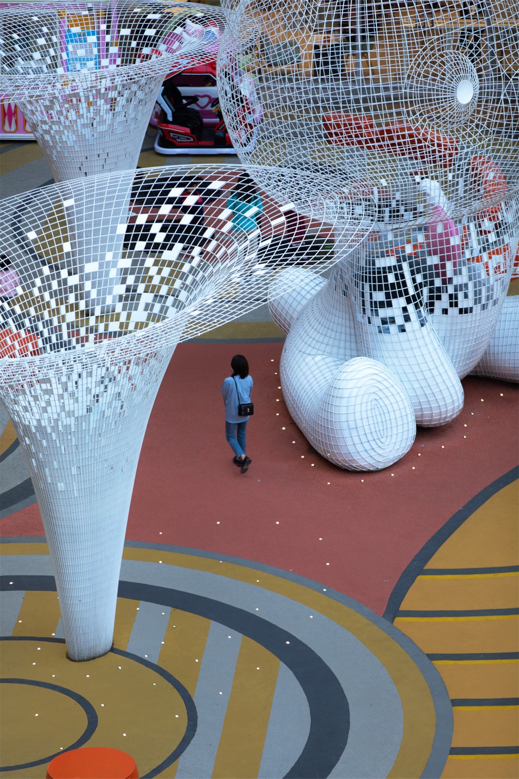

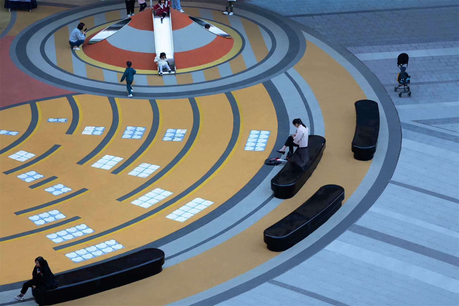
我们在儿童活动区加入了互动的元素,带有小熊地垫的为感应铺装,触发踩踏它可以触发主体小熊心脏亮动。
We have added an interactive element to the children’s activity area. Trigger stepping on it to trigger the main bear’s heart to move.


此外,广场上设置了多种类似可移动的元素,它可以作为儿童游具,可以作为城市家具,景观座椅等。
In addition, a variety of similar movable elements are set up on the square, which can be used as children's play equipment, urban furniture, landscape seats, etc.
▼可移动模数家具


我们对场地还有一个争取的点就是把建筑原本高出地面的采光天窗做平,这样不仅使原本割裂的场地变得完整,还可以将这里变成一个科技现代化的露天剧场,结合中心外摆区,通过户外投影的动态播放,为商场创造了不一样的活动主题。
Another point we have for the site is to flatten the skylights of the building that were originally higher than the ground. This not only makes the original fragmented site complete, but also turns it into a technologically modernized amphitheatre. Combined with the center outside area, through the dynamic playback of outdoor projections, a different event theme is created for the shopping mall.
▼采光井结合外摆休闲区
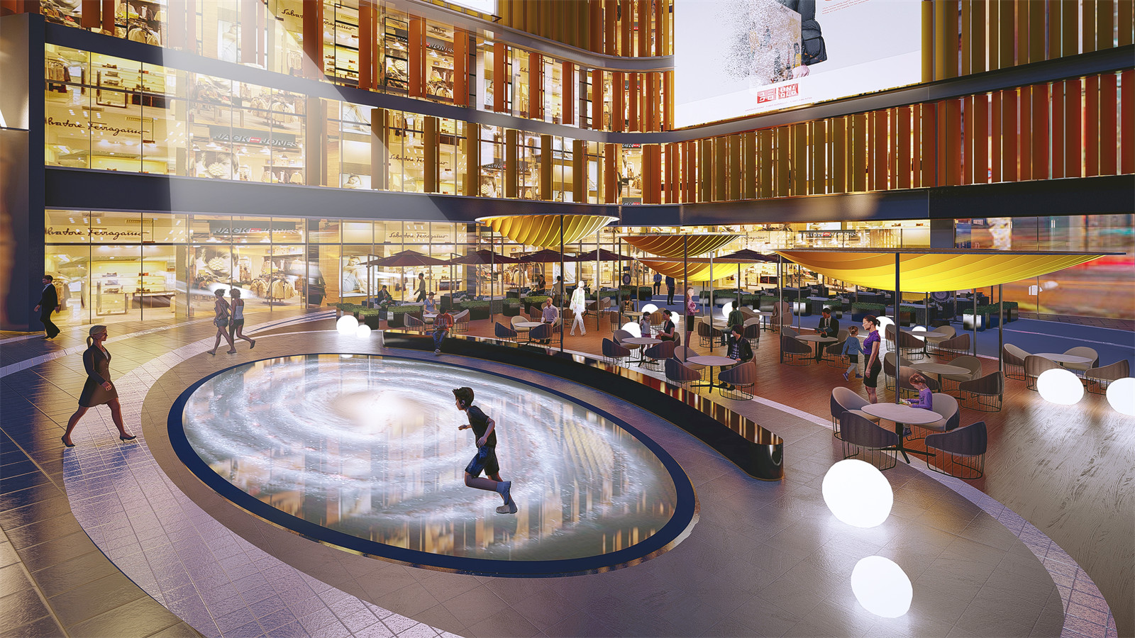
▼体量消解,回应景观空间关系
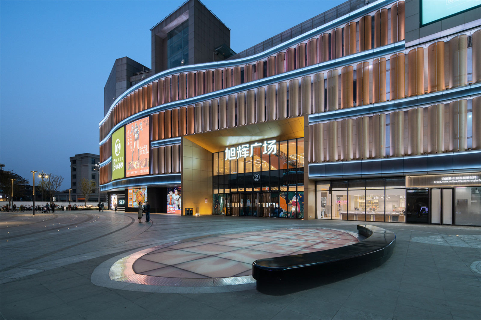
▼从采光井看儿童活动区
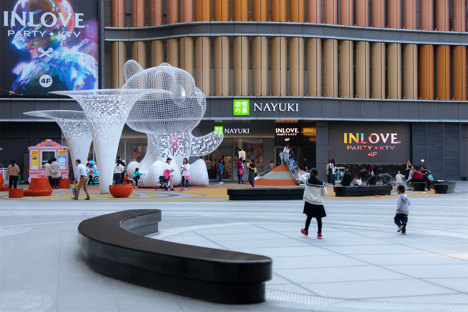
▼成组的户外遮阳构筑物支撑悬挑,使其具有轻盈漂浮的美感

▼寓意梦幻峡谷的下沉广场入口


▼从下沉广场看儿童活动区
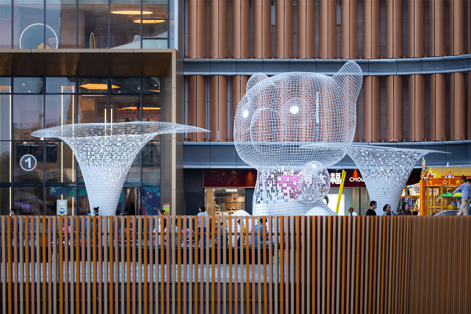
我们将市政展示面打开,设计流线型的石材结合绿植座椅,创造了绿意盎然的景观展示面。
We opened the municipal retail frontage designed streamlined stone and green chairs to create a green landscape display surface.
▼市政绿化展示面

设计过程
DESIGN PROCESS
过程 ·头脑风暴
前期的头脑风暴,相同的场地会有不同的解答,或许,景观能给商业的复兴提供新的思路。这种比较出挑的想法,只能停留在概念阶段,但是或许,有一些方向可能会成为下一轮的商业趋势。
In the early brainstorming, the same venue will have different answers. Perhaps the landscape can provide new ideas for the revival of business.This kind of out-of-the-ordinary idea can only stay at the conceptual stage, but perhaps, there are some directions that may become the next round of business trends.


▼平面方向尝试


平面方向最终选定为左下角的方案,将人直接引入商业建筑的同时,设计语言又比较统一。当大致空间确定下来的时候,我们的方案渐渐清晰了。
▼命题式“树”的主题空间尝试
当我们再深层次挖掘旭辉的精神时,我们加入了旭辉的特色IP——旭小熊。
▼儿童方向过程


▼最终方向

施工过程
CONSTRUCTION
雕塑 ·游具 · 铺装
▼雕塑IP模具

▼雕塑分开运输现场组装焊接,现场把控雕塑的朝向

▼施工人员安装互动的熊掌铺装

▼模具工厂制作后运输到现场

设计总结
EPILOGUE
改造前 · 改造后
旭辉嘉兴广场的改造项目在完成场地本身功能需求的同时,有力的解决了场地抛出的问题,并且作为植入的新空间激活了旧有环境。将原本深藏不露的U型广场,通过下沉广场位置移动,商场内部动线调整,建筑立面连续化 ,向城市开放 ,为振兴嘉兴尽了一份力。
The renovation project of CIFI Jiaxing Plaza not only fulfills the functional requirements of the site itself, but also effectively solves the problems thrown up by the site, and activates the old environment as an implanted new space. The originally hidden U-shaped square was moved through the position of the sunken square, the internal circulation of the shopping mall was adjusted, the building facade was continuous, and it was opened to the city, contributing to the revitalization of Jiaxing.
▼改造前,改造后


项目信息
项目名称:旭辉嘉兴广场
建筑设计:HASSELL香港事务所
景观设计:荷于景观设计咨询(上海)有限公司
项目地址:浙江省嘉兴市老城区中山东路
景观面积:7300㎡
开放时间:2020年11月29日
设计总监:萧泽厚
方案设计团队:任雪雪,薛成杰,杨瑞鹏,邱乾元,徐扬
后期设计总监:程鸣 、李生贵
后期设计团队:万志晔 、万倩楠
甲方团队:旭辉:熊湘桂,杨光
景观施工单位:浙江天姿园林建设有限公司
摄影: 须然摄影、邬涛
Project name: CIFI Jiaxing Plaza
Architectural design: HASSELL Hong Kong Office
Landscape design: Waterlily design studio co, Ltd
Project location: Zhongshan East Road, Old Town, Jiaxing City, Zhejiang Province
Site Area: 7300㎡
Opening time: November 29, 2020
Design director: TSEHOU HSRAO
Scheme design team: Ren Xuexue, Xue Chengjie, Yang Ruipeng, Qiu Qianyuan, Xu Yang
Construction design director: Cheng Ming, Li Shenggui
Construction design team: Wan Zhiye, Wan Qiannan
Clients team: CIFI -Xiong Xianggui, Yang Guang
Landscape construction company: Zhejiang Tianzi Garden Construction Co., Ltd.
Photographers: Shrimp Studio——Wu Tao
版权声明:本文版权归原作者所有,请勿以江南电竞官网登录入口
编辑版本转载。如有侵犯您的权益请及时联系,我们将第一时间删除。
投稿邮箱:info@landscape.cn
项目咨询:18510568018(微信同号)
发表评论
热门评论


